Creative Screenshot Guide
For some Advertisers or Brands, screenshots or screen ‘mockups’ of what their Creative will look like on the websites where it is running may be an important deliverable to better understand their campaigns. These can easily be created utilizing images of the Creatives and website screenshots:
- Take screenshots of all your creatives. Here are examples of what you want from each screenshot:
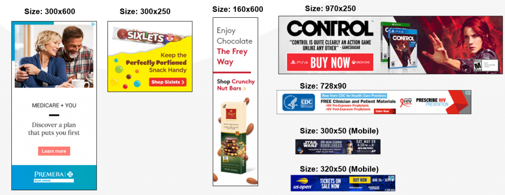
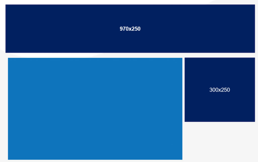
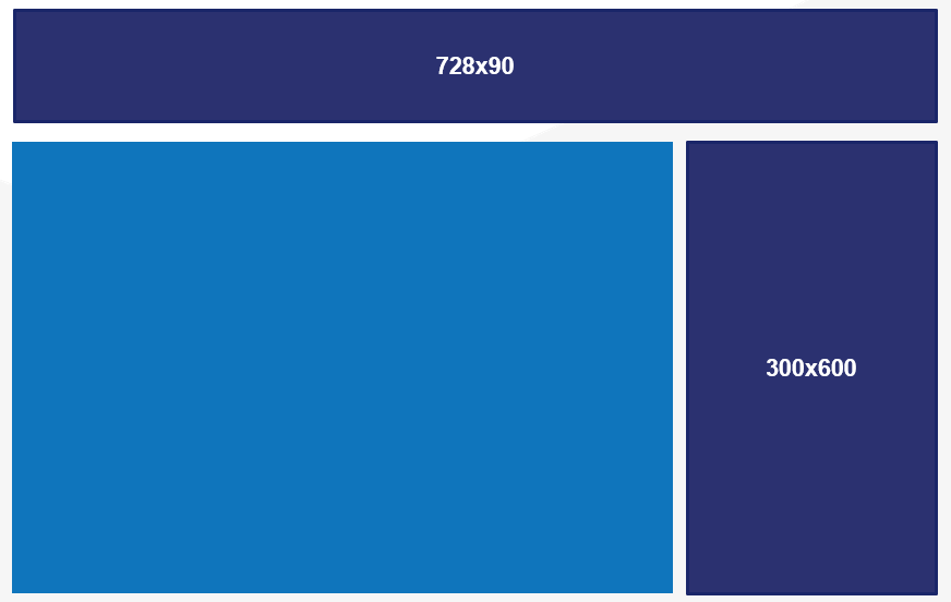
- Take screenshots of the websites that you want the ads to be display on and the matching ad sizes. See ‘Placements’ below to see where some of the most common ad sizes can be found on the pages. Follow these tips to get great website screenshots:
- Make sure your screenshots are clean and include the URL, but do not include tabs etc.
- Make sure the page has fully loaded, check the loading bar in the bottom left corner to verify. If there’s a video on the page, wait for the video to load and exclude the pre-roll where applicable.
- Do not include any negative or controversial news. Topics can include but are not limited to politics, chronic disease, death, inappropriate clothing, and controversial topics.
- 160×600 ads are harder to find but they are almost always on the mail domains:
- Try to find articles that are “on brand.” For example, do not place an ad for a nursing home on bodybuilding.com.
- Do not place ads on a page with other competing or conflicting brands. For example, if you are placing an ad for a pharmaceutical company, make sure there are no other ads for anything pharmaceutical related.
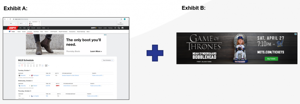
- Copy and paste your creatives on the website screenshots and fully cover up ads. SAVE final product as a new image:
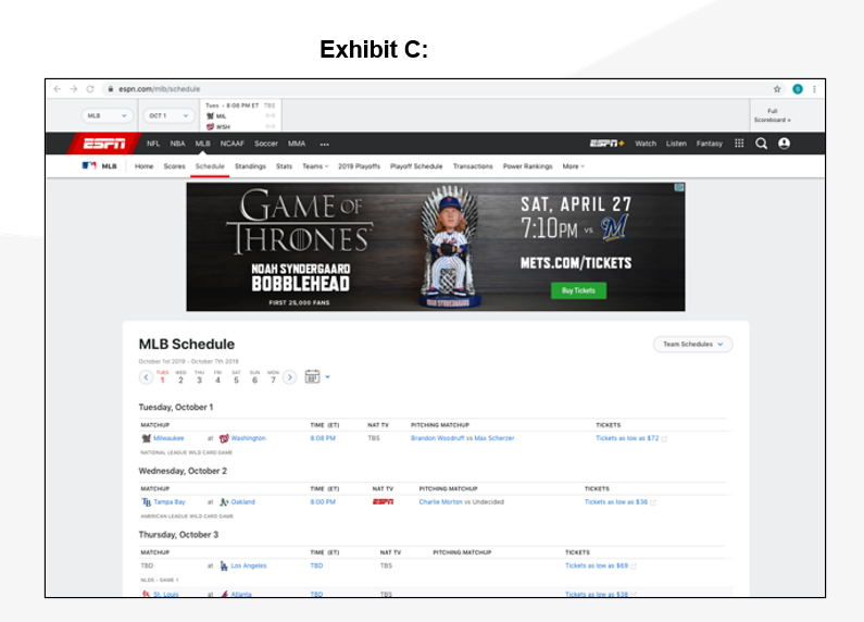
Desktop Placements:

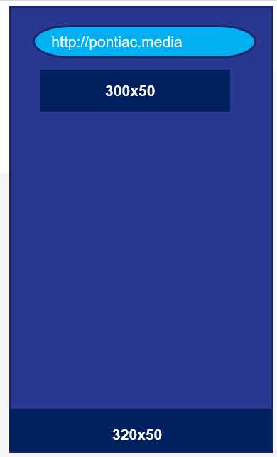
Mobile Placements:
