Summary
The summary section within Standard Reporting provides a high level glance of the selected Advertiser, Campaign, and Lines for the Reporting Interval. This section is broken into top tiles, two metrics comparison chart, a downloadable CSV file to conduct further analysis, Volume by Hour Heatmap, Pie charts, Transparency (% reported), and Video Events. Continue to read about each section.
Top Tiles

Note that all intervals with the exception of yesterday, include metrics from today. Today’s metrics update hourly and have a 3 hour delay. The metrics include:
- Report Date: Shows the selected report date or date range.
- Impressions: The total number of impressions the selected Advertiser, Campaign, and Lines served within the selected reporting interval.
- Total Cost: The total amount of spend that the selected Advertiser, Campaign, and Lines spent, including media costs and any applicable margins or fees, within the selected reporting interval.
- Total Cost CPM: The total cost per thousand impressions for the selected Advertiser, Campaign, and Lines within the selected reporting interval, calculated as (Total Cost / Impressions) x 1,000.
- Revenue: The total amount of revenue generated by the selected Advertiser, Campaign, and Lines within the selected reporting interval.
- Transparency Score: A score indicating the level of transparency in reporting and data availability.
Metric Comparison Chart
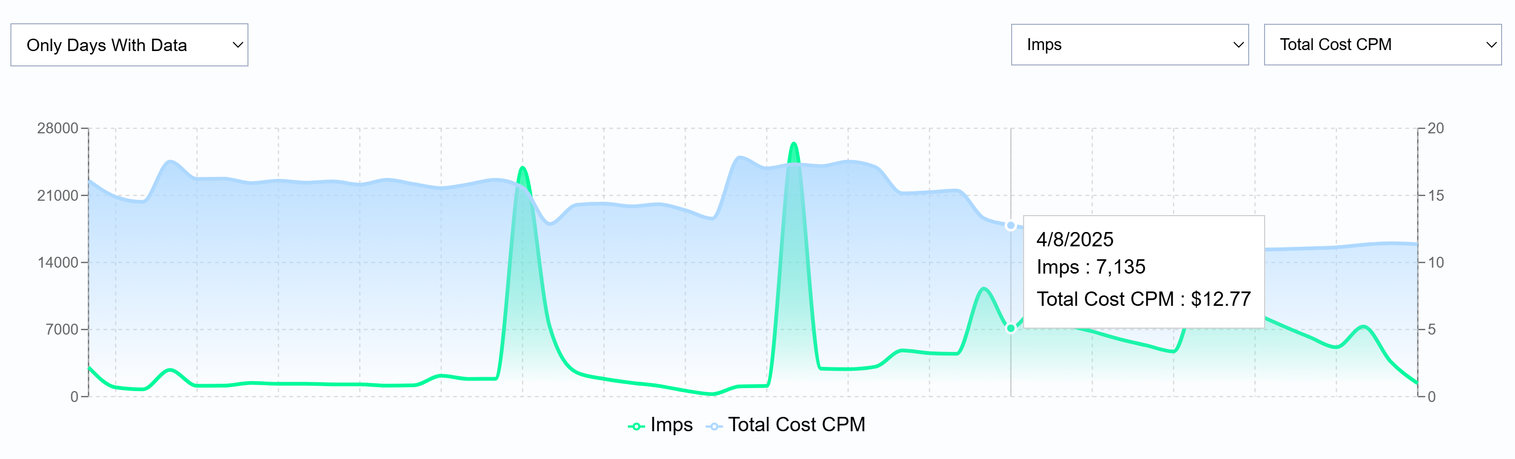
Filter for only days with data or all days and select and compare two metrics against each other. Select from the following metrics:
- Imps: The total number of impressions served within the selected reporting interval.
- Media Cost: The total dollar amount spent on the media before additional fees or margins are applied.
- Total Cost: The total spend, including media costs and any applicable margins or fees.
- Total Cost CPM: The total cost per thousand impressions, calculated as (Total Cost / Impressions) x 1,000.
- Revenue: The total revenue generated from the selected reporting interval.
- VCR: The percentage of video ad impressions that are played to completion.
- IP Conversions: The number of conversions attributed to users who were served an ad and later converted based on IP tracking.
- Foot Traffic ‘Attributed Visitors’: The number of users who visited a physical location after viewing an ad.
Downloadable Table
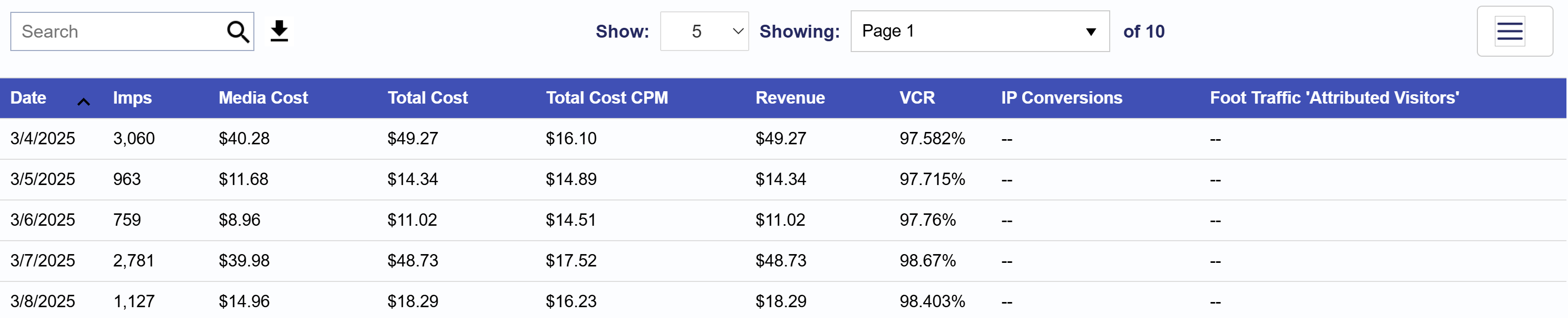
Below the chart, locate the search bar in the Table section. On the right-hand side of the search bar, click the download button to export the performance data as a CSV file. All metrics listed above are available for export. To customize the metrics included in the CSV file, click the three lines in the top right corner of the table and select or deselect the metrics that matter most to you.
Volume by Hour Heatmap
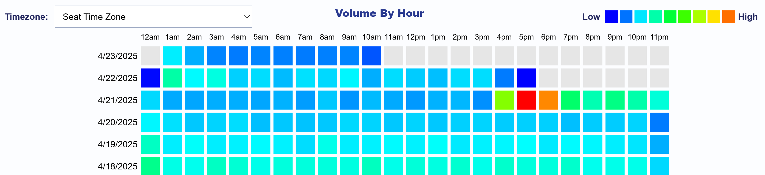
The Volume by Hour Heatmap allows you to explore activity patterns over time. By default, the heatmap is displayed using your Seat’s time zone, but you can filter for any time zone as needed. Use the color key in the top right corner to interpret volume levels from low to high. This visualization highlights hourly volume trends by date, making it easy to identify peak activity periods and uncover actionable insights. Hover over any cell to view the Total Cost for that specific date and hour. Use this heatmap to quickly detect spikes in volume, optimize dayparting strategies, or compare performance across time zones.
Pie Charts
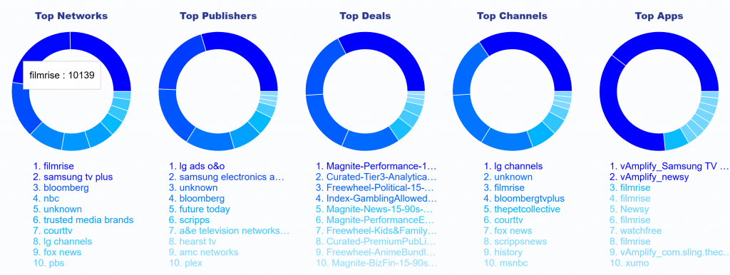
The Pie Charts section highlights the top 10 impression performers across key supply sources: Networks, Publishers, Deals, Channels, and Apps. This visualization offers a quick snapshot of which sources are driving the most impressions. When hovering over a segment in any pie chart, you’ll see displayed the name of the supply source and the number of impressions served, helping you quickly identify high performing supply sources.
Transparency (% reported)
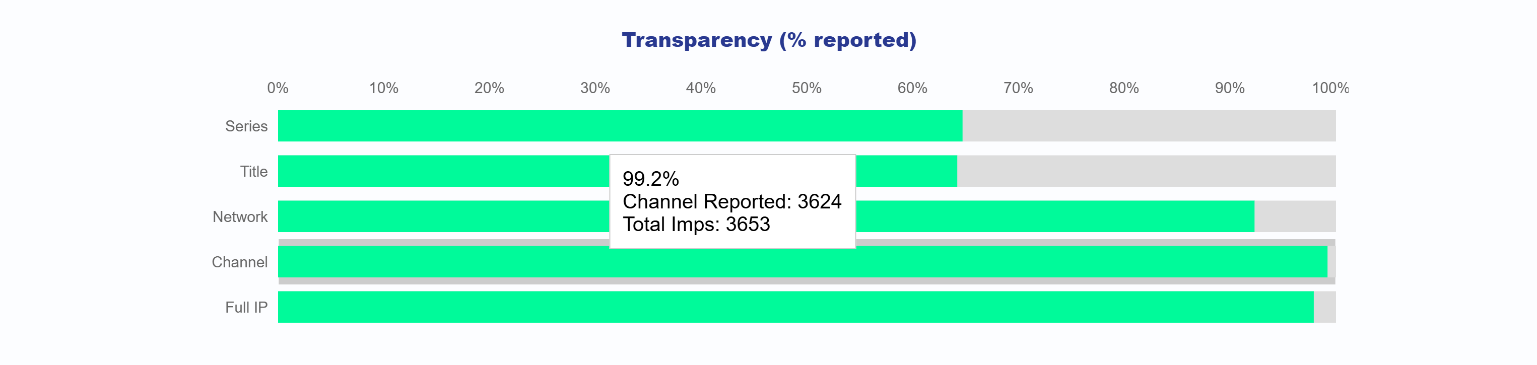
The Transparency Chart displays the reporting percentages for key inventory identifiers including Series, Title, Network, Channel, and Full IP. It helps users understand what portion of impressions include data for each category. For each identifier, the chart shows:
- The percentage of impressions where the value was reported
- The number of unique values reported
- The total number of impressions associated with that category
This provides a clear view into the transparency of supply sources and helps identify areas where reporting may be limited.
Video Events
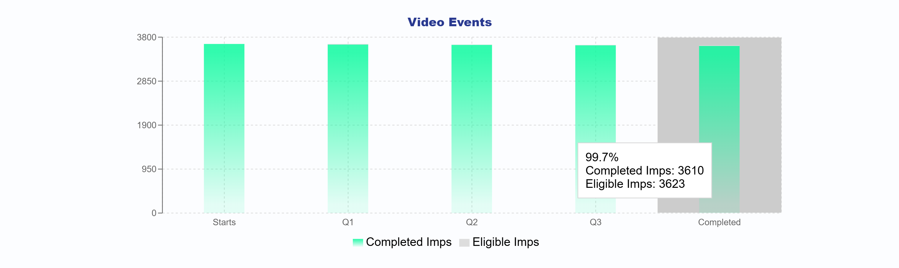
The Video Events bar chart illustrates each stage of the video playback journey from Start through Q1, Q2, Q3, to Complete. It offers a clear breakdown of how many impressions reached each milestone. You can compare your eligible impressions with your completed impressions to evaluate overall video performance and completion rates across your campaign.