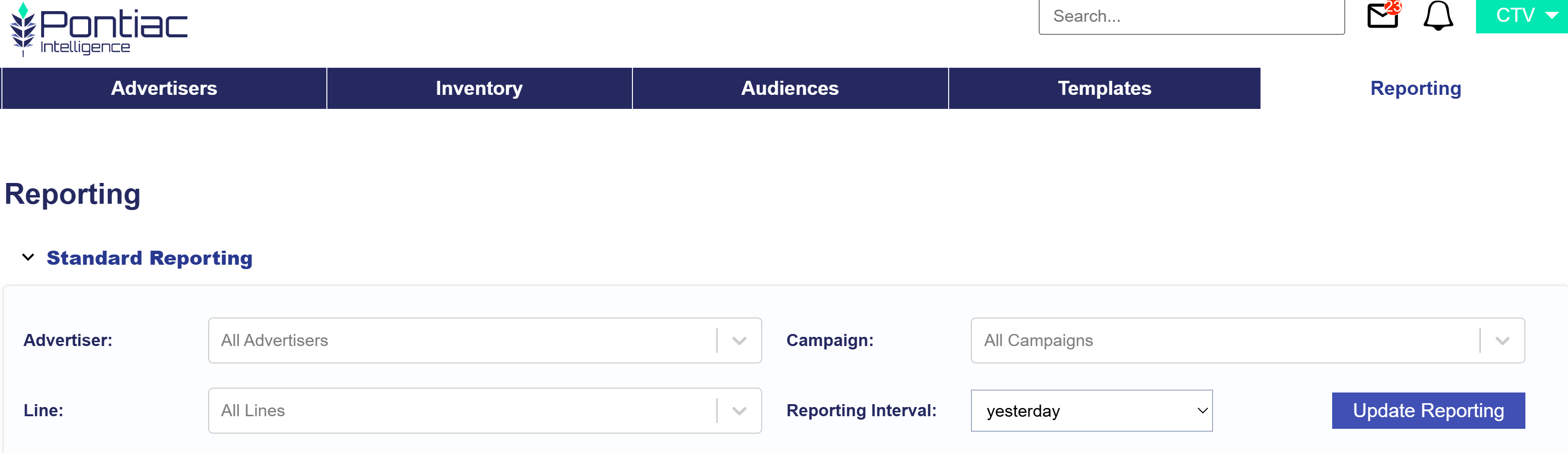
In the Reporting tab of the CTV platform, create a Standard Report by selecting the Advertisers, Campaigns, and Lines you want to analyze. This report provides summarized data and charts to help evaluate performance and identify key insights. The sections include:
Summary
Inventory
Creatives
Device Type
Foot Traffic
Geo
Continue to each section to learn more.
Summary
The summary section within Standard Reporting provides a high level glance of the selected Advertiser, Campaign, and Lines for the Reporting Interval. This section is broken into top tiles, two metrics comparison chart, a downloadable CSV file to conduct further analysis, Volume by Hour Heatmap, Pie charts, Transparency (% reported), and Video Events. Continue to read about each section.
Top Tiles
Note that all intervals with the exception of yesterday, include metrics from today. Today’s metrics update hourly and have a 3 hour delay. The metrics include:
Report Date: Shows the selected report date or date range.
Impressions: The total number of impressions the selected Advertiser, Campaign, and Lines served within the selected reporting interval.
Total Cost: The total amount of spend that the selected Advertiser, Campaign, and Lines spent, including media costs and any applicable margins or fees, within the selected reporting interval.
Total Cost CPM: The total cost per thousand impressions for the selected Advertiser, Campaign, and Lines within the selected reporting interval, calculated as (Total Cost / Impressions) x 1,000.
Revenue: The total amount of revenue generated by the selected Advertiser, Campaign, and Lines within the selected reporting interval.
Transparency Score: A score indicating the level of transparency in reporting and data availability.
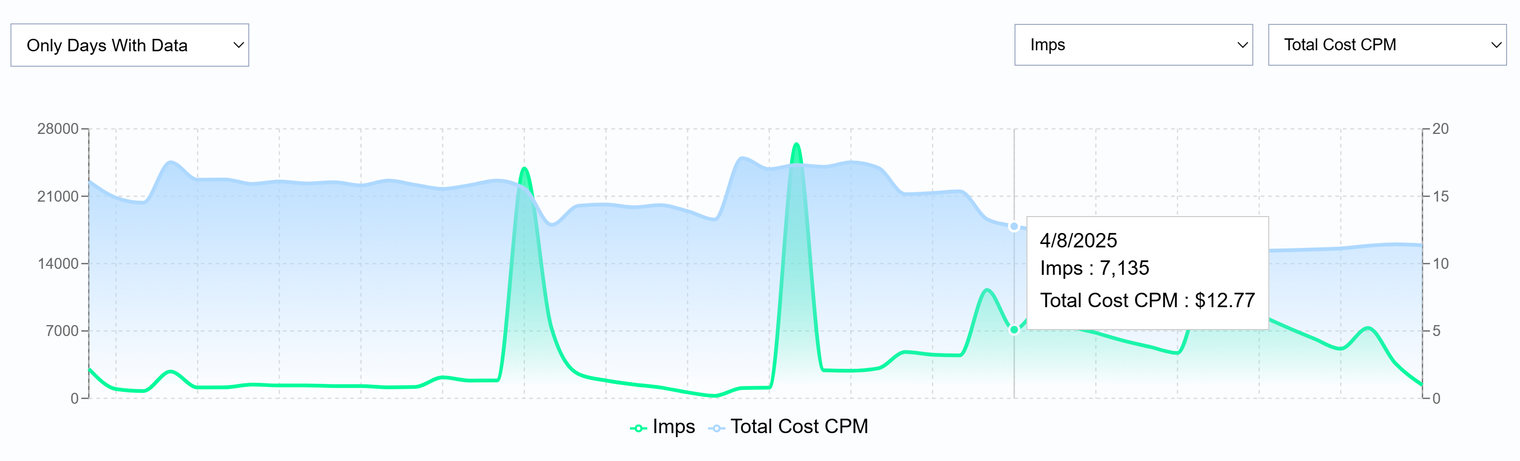
Metric Comparison Chart
Filter for only days with data or all days and select and compare two metrics against each other. Select from the following metrics:
Imps: The total number of impressions served within the selected reporting interval.
Media Cost: The total dollar amount spent on the media before additional fees or margins are applied.
Total Cost: The total spend, including media costs and any applicable margins or fees.
Total Cost CPM: The total cost per thousand impressions, calculated as (Total Cost / Impressions) x 1,000.
Revenue: The total revenue generated from the selected reporting interval.
VCR: The percentage of video ad impressions that are played to completion.
IP Conversions: The number of conversions attributed to users who were served an ad and later converted based on IP tracking.
Foot Traffic ‘Attributed Visitors’: The number of users who visited a physical location after viewing an ad.
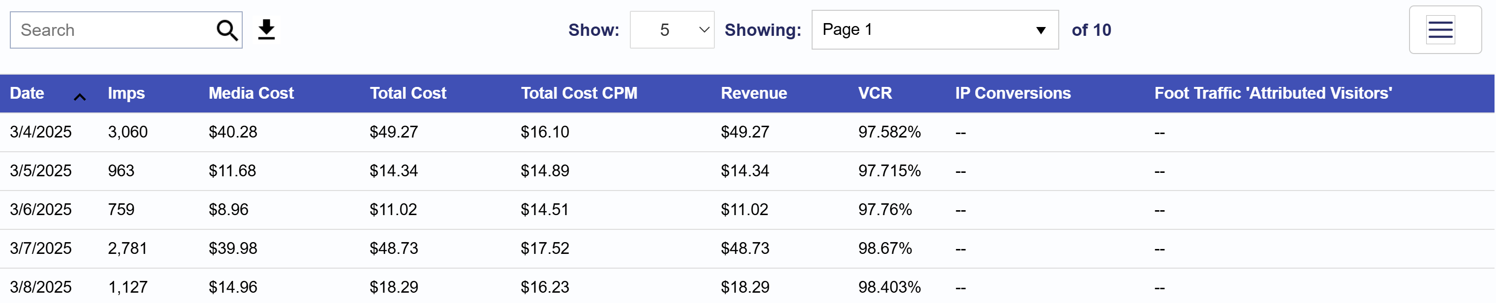
Downloadable Table
Below the chart, locate the search bar in the Table section. On the right-hand side of the search bar, click the download button to export the performance data as a CSV file. All metrics listed above are available for export. To customize the metrics included in the CSV file, click the three lines in the top right corner of the table and select or deselect the metrics that matter most to you.
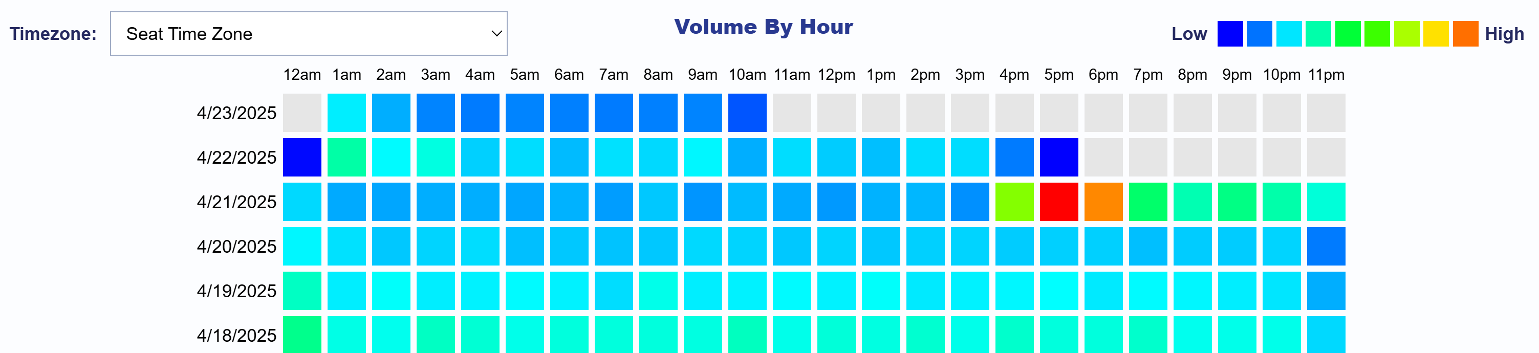
Volume by Hour Heatmap
The Volume by Hour Heatmap allows you to explore activity patterns over time. By default, the heatmap is displayed using your Seat’s time zone, but you can filter for any time zone as needed. Use the color key in the top right corner to interpret volume levels from low to high. This visualization highlights hourly volume trends by date, making it easy to identify peak activity periods and uncover actionable insights. Hover over any cell to view the Total Cost for that specific date and hour. Use this heatmap to quickly detect spikes in volume, optimize dayparting strategies, or compare performance across time zones.
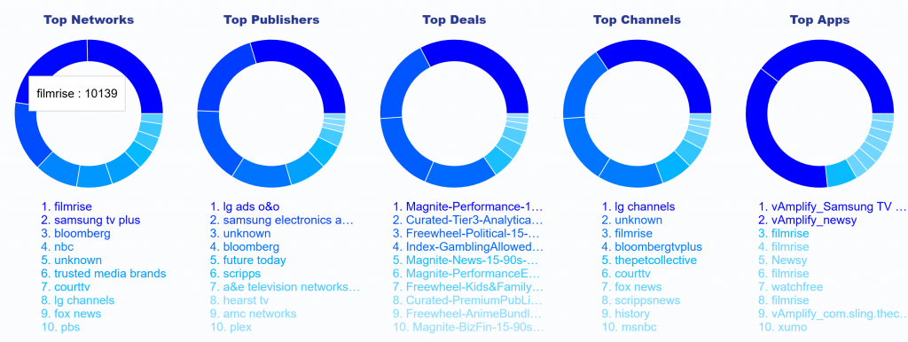
Pie Charts
The Pie Charts section highlights the top 10 impression performers across key supply sources: Networks, Publishers, Deals, Channels, and Apps. This visualization offers a quick snapshot of which sources are driving the most impressions. When hovering over a segment in any pie chart, you’ll see displayed the name of the supply source and the number of impressions served, helping you quickly identify high performing supply sources.
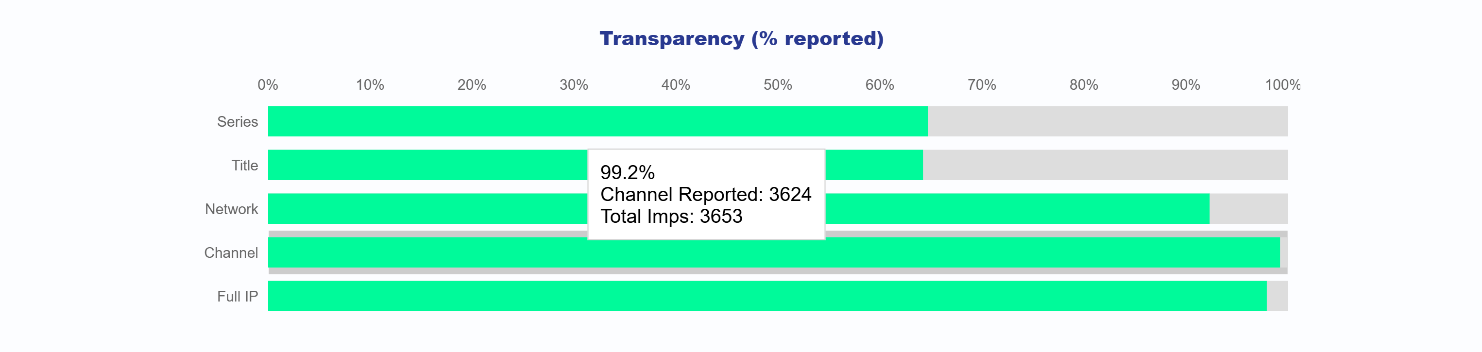
Transparency (% reported)
The Transparency Chart displays the reporting percentages for key inventory identifiers including Series, Title, Network, Channel, and Full IP. It helps users understand what portion of impressions include data for each category. For each identifier, the chart shows:
The percentage of impressions where the value was reported
The number of unique values reported
The total number of impressions associated with that category
This provides a clear view into the transparency of supply sources and helps identify areas where reporting may be limited.
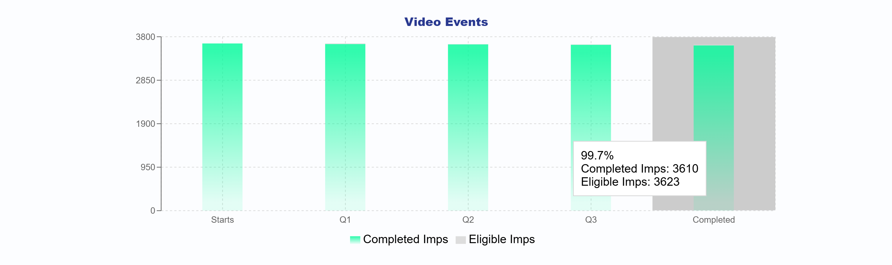
Video Events
The Video Events bar chart illustrates each stage of the video playback journey from Start through Q1, Q2, Q3, to Complete. It offers a clear breakdown of how many impressions reached each milestone. You can compare your eligible impressions with your completed impressions to evaluate overall video performance and completion rates across your campaign.
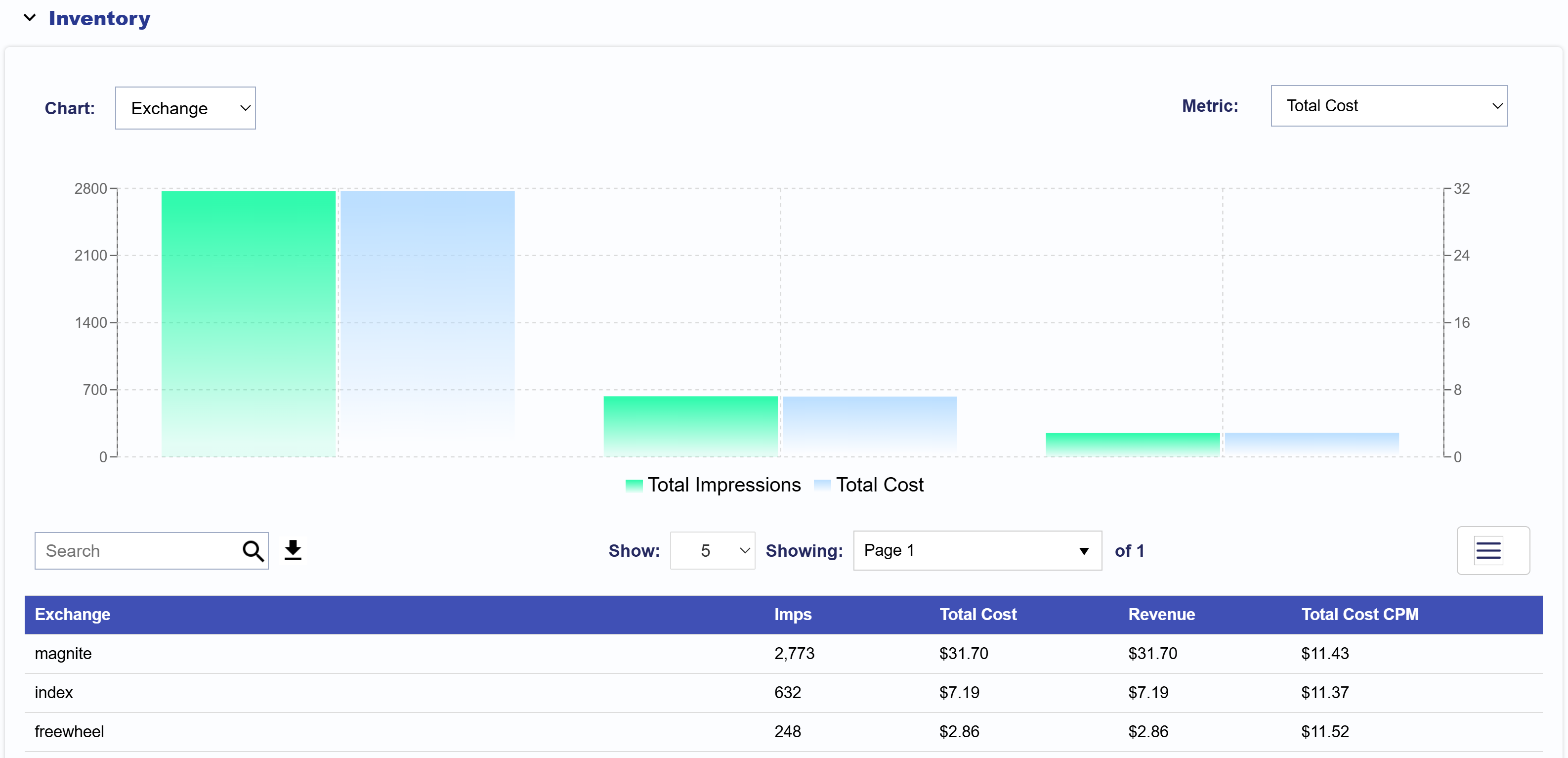
Inventory
The Inventory dropdown section features both a chart and a table to help you analyze campaign performance by inventory source. The chart can be filtered by categories such as Site Domain, Exchange, Publisher, Series, Title, and Genre, and metrics such as Total Cost, Revenue, Total Cost CPM, and Transparency Score, offering flexible insight into impression and cost trends.
The bar chart displays the selected category and metric. Hover over each bar pair to view the Category Name, Total Impressions, and Total Cost. To adjust how many are shown, use the Show: dropdown to display 5, 10, 25, 50, or 100 results.
To export data, go to the Table section. On the right side of the search bar, click the download icon to export the table as a CSV file. All metrics mentioned above are included as well as impressions. To customize the export, click the three line icon in the top right of the table to select or deselect the metrics most relevant to your analysis.
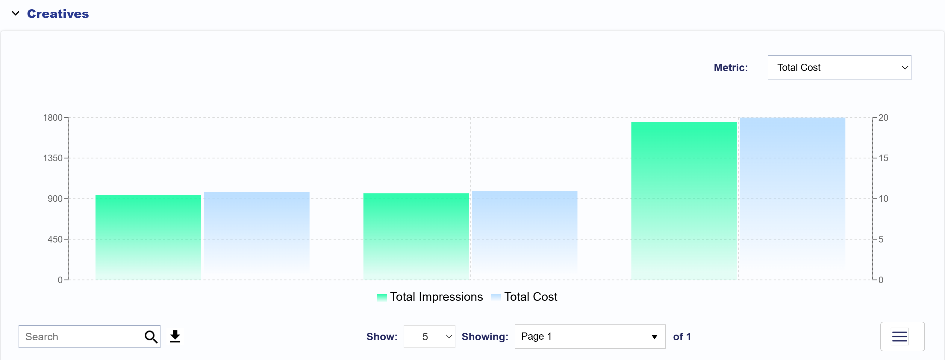
Creatives
The Creatives section displays Total Cost and Impressions for each creative associated with the selected Advertiser, Campaign, and Lines in the top filter section, based on the selected reporting interval. The left Y-axis shows Impression counts, while the right Y-axis shows Total Cost, helping you compare delivery and spend across creatives at a glance.
You can adjust the metric compared to Total Impressions to show Total Cost, Revenue, Total Cost CPM, or Completion Rate for more customized analysis.
To export this data, scroll down to the Table section below the chart. On the right side of the search bar, click the download icon to export the table as a CSV file. You can further customize your export by clicking the three line icon in the top right corner of the table to select or deselect the metrics that are most relevant to your analysis.
Below are the available metric:
Creative ID: The unique ID assigned to your creative.
Name: The name of the creative.
Imps: The total number of impressions the creative served.
Total Cost: The total spend attributed to the creative.
Revenue: The revenue generated by the creative.
Total Cost CPM: The cost per thousand impressions (CPM).
Completion Rate: The percentage of impressions that completed the full video.
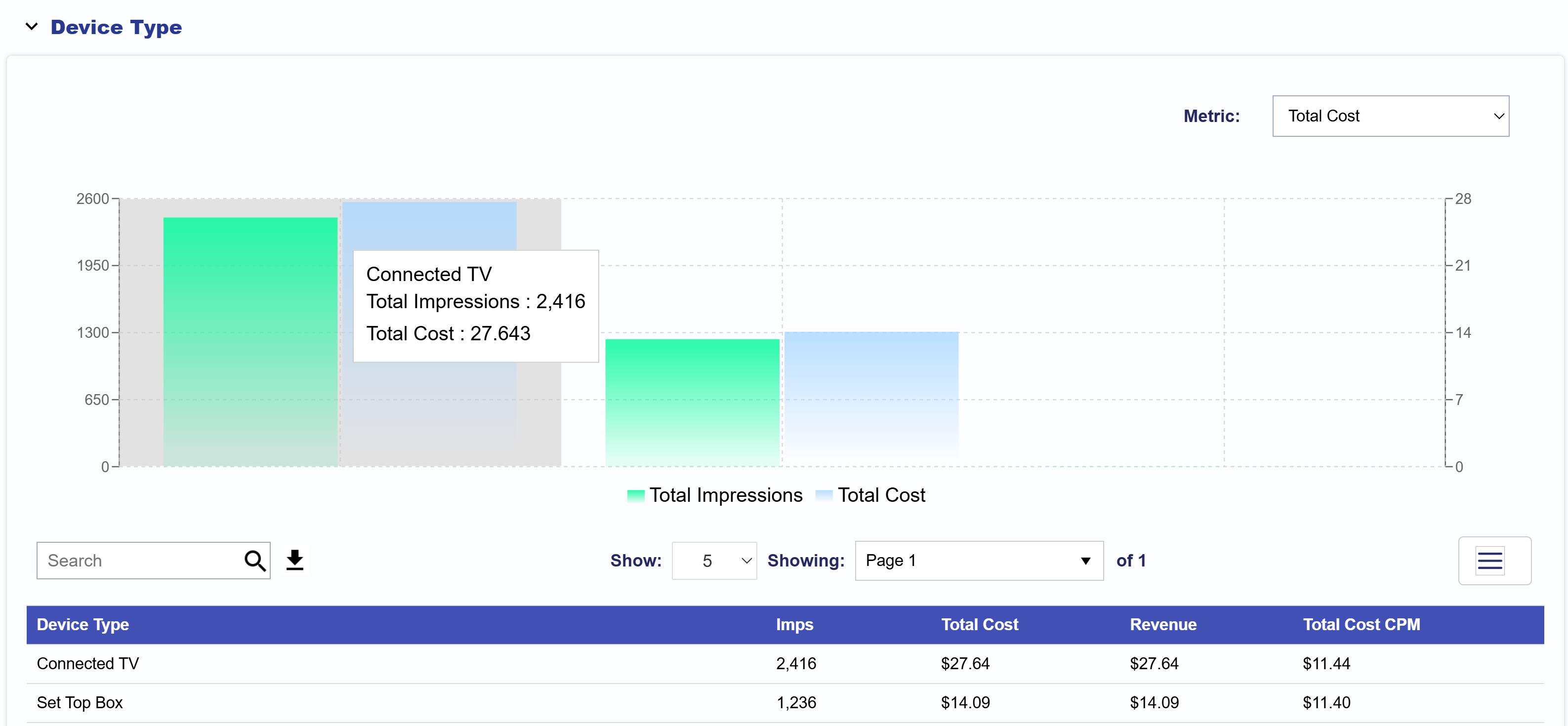
Device Type
The Device Type section displays Total Cost and Impressions for each device type associated with the selected Advertiser, Campaign, and Lines in the top filter section, based on the selected reporting interval. The data is broken down by device type, allowing you to compare performance across different devices. The left Y-axis shows Impression counts, while the right Y-axis shows Total Cost, helping you easily compare delivery and spend across devices at a glance.
You can adjust the metric compared to Total Impressions to show Total Cost, Revenue, or Total Cost CPM for more customized analysis.
To export this data, scroll down to the Table section below the chart. On the right side of the search bar, click the Download icon to export the table as a CSV file. You can further customize your export by clicking the three line icon in the top right corner of the table to select or deselect the metrics that are most relevant to your analysis.
Device Type: The name of the device type.
Imps: The total number of impressions served by each device type.
Total Cost: The total spend attributed to each device type.
Revenue: The revenue generated by each device type.
Total Cost CPM: The cost per thousand impressions (CPM) for each device type.
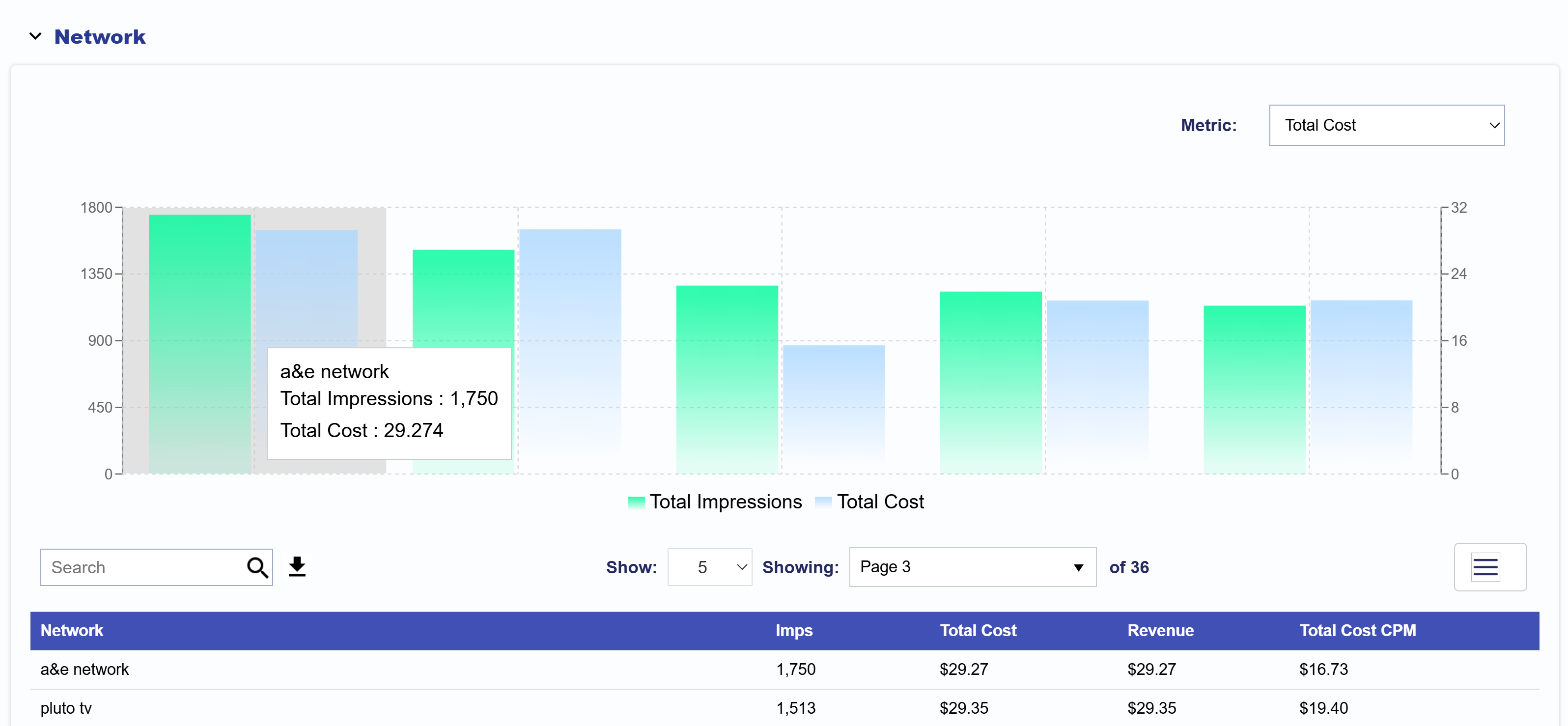
Network
The Network section displays Total Cost and Impressions for each network associated with the selected Advertiser, Campaign, and Lines in the top filter section, based on the selected reporting interval. The data is broken down by network, allowing you to compare performance across different inventory sources. The left Y-axis shows Impression counts, while the right Y-axis shows Total Cost, making it easy to compare delivery and spend across networks at a glance.
You can adjust the metric compared to Total Impressions to show Total Cost, Revenue, or Total Cost CPM for more customized analysis.
To export this data, scroll down to the Table section below the chart. On the right side of the search bar, click the Download icon to export the table as a CSV file. You can further customize your export by clicking the three-line icon in the top right corner of the table to select or deselect the metrics most relevant to your analysis.
Network: The name of the network.
Imps: The total number of impressions served by each network.
Total Cost: The total spend attributed to each network.
Revenue: The revenue generated by each network.
Total Cost CPM: The cost per thousand impressions (CPM) for each network.
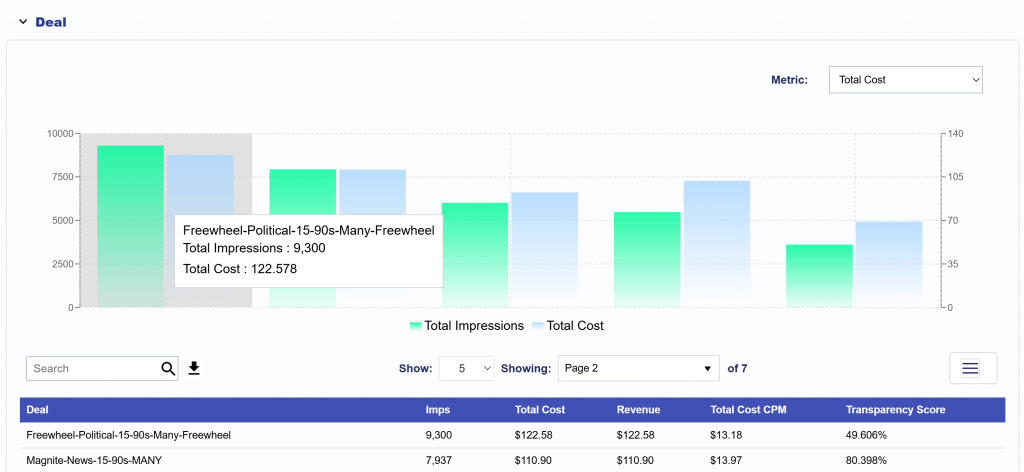
Deal
The Deal section displays a chosen metric and Impressions for each deal associated with the selected Advertiser, Campaign, and Lines in the top filter section, based on the selected reporting interval. The data is broken down by deal, allowing you to compare performance across different deals. The left Y-axis shows Impression counts, while the right Y-axis shows your chosen metric, making it easy to compare delivery and spend across deals at a glance.
You can adjust the metric compared to Total Impressions to show Total Cost, Revenue, Total Cost CPM, or Transparency Score for more customized analysis.
To export this data, scroll down to the Table section below the chart. On the right side of the search bar, click the Download icon to export the table as a CSV file. You can further customize your export by clicking the three-line icon in the top right corner of the table to select or deselect the metrics that are most relevant to your analysis.
Deal: The name of the deal.
Imps: The total number of impressions served by each deal.
Total Cost: The total spend attributed to each deal.
Revenue: The revenue generated by each deal.
Total Cost CPM: The cost per thousand impressions (CPM) for each deal.
Transparency Score: The score indicating the transparency level of the deal.
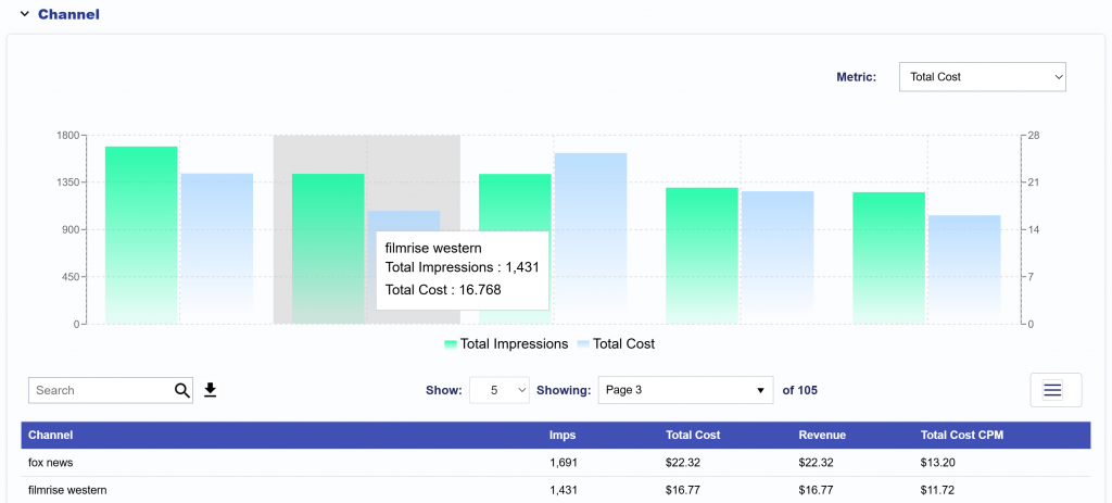
Channel
The Channel section displays a chosen metric and Impressions for each channel associated with the selected Advertiser, Campaign, and Lines in the top filter section, based on the selected reporting interval. The data is broken down by channel, allowing you to compare performance across different channels. The left Y-axis shows Impression counts, while the right Y-axis shows your chosen metric, making it easy to compare delivery and spend across channels at a glance.
You can adjust the metric compared to Total Impressions to show Total Cost, Revenue, or Total Cost CPM for more customized analysis.
To export this data, scroll down to the Table section below the chart. On the right side of the search bar, click the Download icon to export the table as a CSV file. You can further customize your export by clicking the three-line icon in the top right corner of the table to select or deselect the metrics that are most relevant to your analysis.
Channel: The name of the channel.
Imps: The total number of impressions served by each channel.
Total Cost: The total spend attributed to each channel.
Revenue: The revenue generated by each channel.
Total Cost CPM: The cost per thousand impressions (CPM) for each channel.
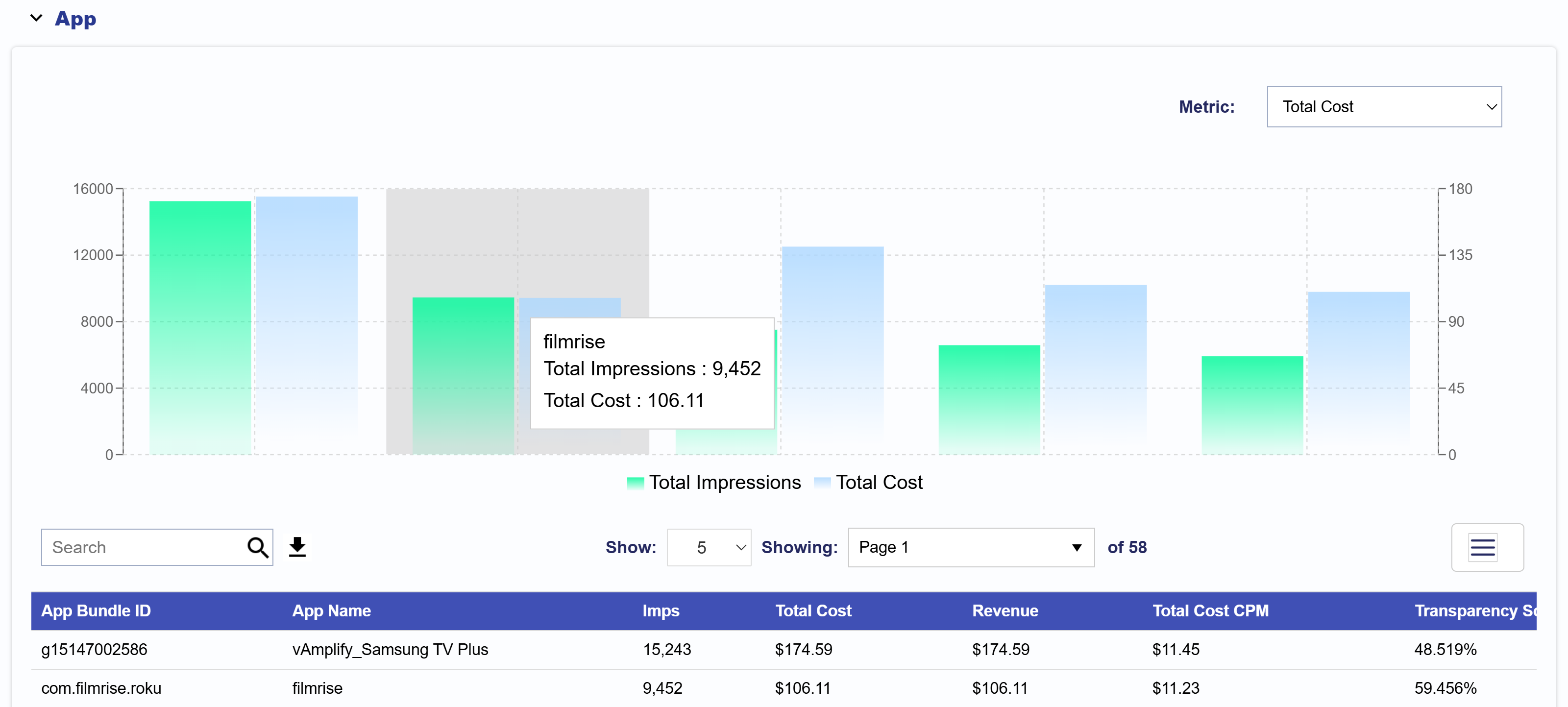
App
The App section displays a chosen metric and Impressions for each app associated with the selected Advertiser, Campaign, and Lines in the top filter section, based on the selected reporting interval. The data is broken down by app, allowing you to compare performance across different apps. The left Y-axis shows Impression counts, while the right Y-axis shows your chosen metric, making it easy to compare delivery and spend across apps at a glance.
You can adjust the metric compared to Total Impressions to show Total Cost, Revenue, Total Cost CPM, Completion Rate, or Transparency Score for more customized analysis.
To export this data, scroll down to the Table section below the chart. On the right side of the search bar, click the Download icon to export the table as a CSV file. You can further customize your export by clicking the three-line icon in the top right corner of the table to select or deselect the metrics that are most relevant to your analysis.
App: The name of the App.
Imps: The total number of impressions served by each App.
Total Cost: The total spend attributed to each App.
Revenue: The revenue generated by each App.
Total Cost CPM: The cost per thousand impressions (CPM) for each App.
Transparency Score: A score indicating the transparency level of the App, helping assess the clarity of supply source information and ad placement.
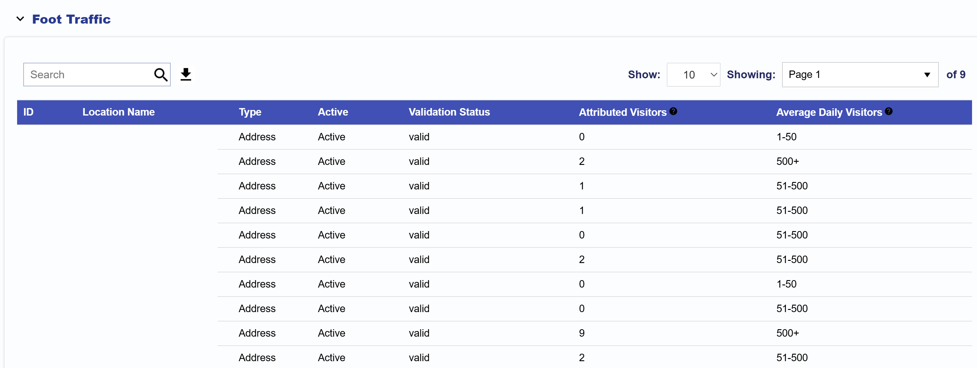
Foot Traffic
The Foot Traffic section shows the following metrics:
Location ID: Unique identifier assigned to the location.
Location Name: The name assigned to the Location.
Type: Specifies the location type (e.g., Address).
Active Status: Indicates whether the location is Active or Inactive.
Validation Status: Displays if the location is Valid or Invalid.
Attributed Visitors: The number of users who were served an Ad from this Campaign and subsequently visited this location during the selected Reporting Interval.
Average Daily Visitor: The average number of total visitors recorded at this location per day within selected reporting interval. This is used to indicate if the address entered is correct and tracking visitors. If 0 visitors are seen at this location, there may be an issue. Contact your Account Manager for more information or for assistance with locations displaying 0 visitors.
The table can be downloaded as a CSV file for further analysis. Click the download button next to the search bar at the top of the table.
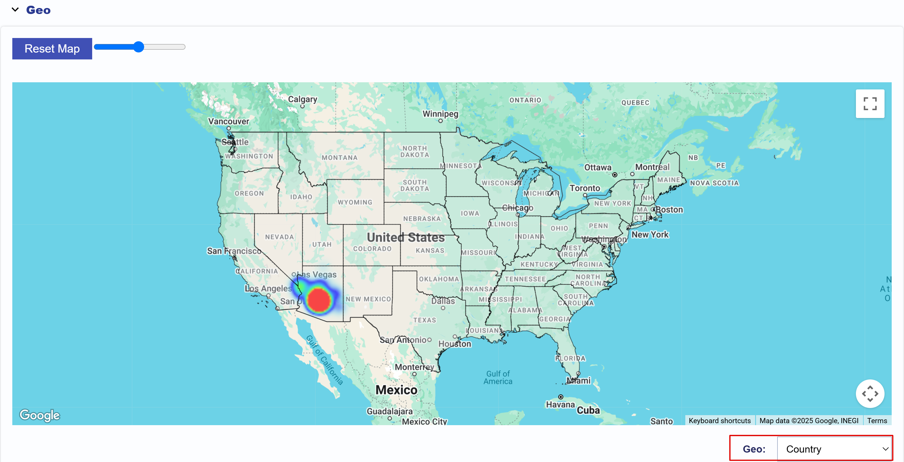
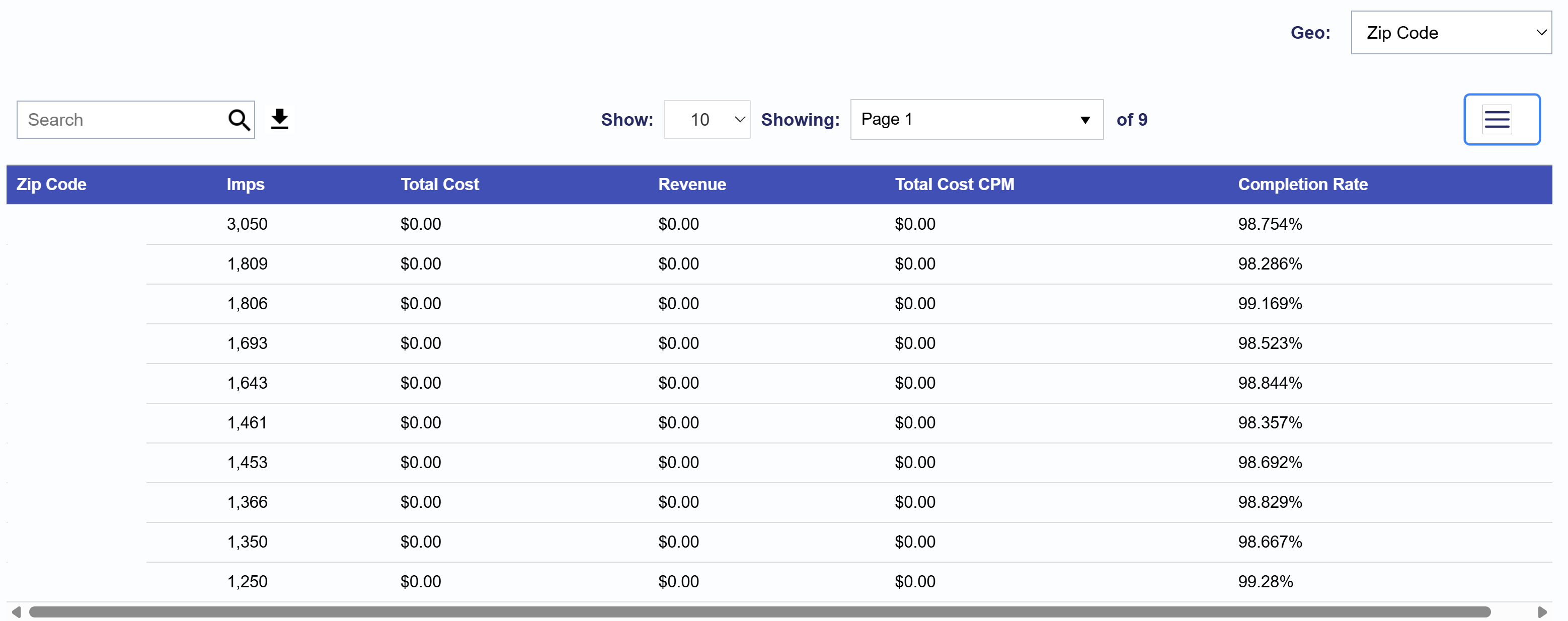
Geo
The Geo section shows a heat map of where impressions served were most concentrated. Use the Geo filter located on the bottom right corner of the Map to filter for Country, Region, DMA, and Zip codes. This filter also impacts the table below the map, which can be downloaded as a CSV file to conduct further analysis.
The table displays metrics based on the selected filters. For example, to view Impressions, Total Cost, Revenue, Total Cost CPM, and Completion Rate by Zip Code, apply the Geo filter for Zip Codes.