Most analytics tools tell you what happened. Pontiac Analytics tells you what to do about it and makes it effortless to act. No complex integrations, no engineering lift, no waiting. The same platform where you run your campaigns is where you understand, optimize, and prove their impact.
The Pontiac Analytics suite is built around three pipelines that cover the full campaign lifecycle. From understanding your audience before you spend, to optimizing delivery while you do, to proving impact after the fact. Every model is transparent by design, showing you exactly how decisions are made. And when you’re ready to act, applying insights to your campaigns takes a single click.
Audience — Understand Your Audience
Know who converts, what defines them, and where to find more of them before you spend a dollar. Built on privacy-safe, census-based demographic modeling, the Audience tool turns ZIP-level data into clear personas and lookalike expansion targets, so your targeting starts smart and scales smarter.
Targeting — Activate & Optimize
Stop guessing which variables are driving performance. The Targeting tool surfaces exactly what’s working by geography, device, content, time of day, and more, and applies that intelligence directly to your real-time bidding with one click. Less waste. Better performance. No manual breakouts required.
Incrementality — Prove What Works
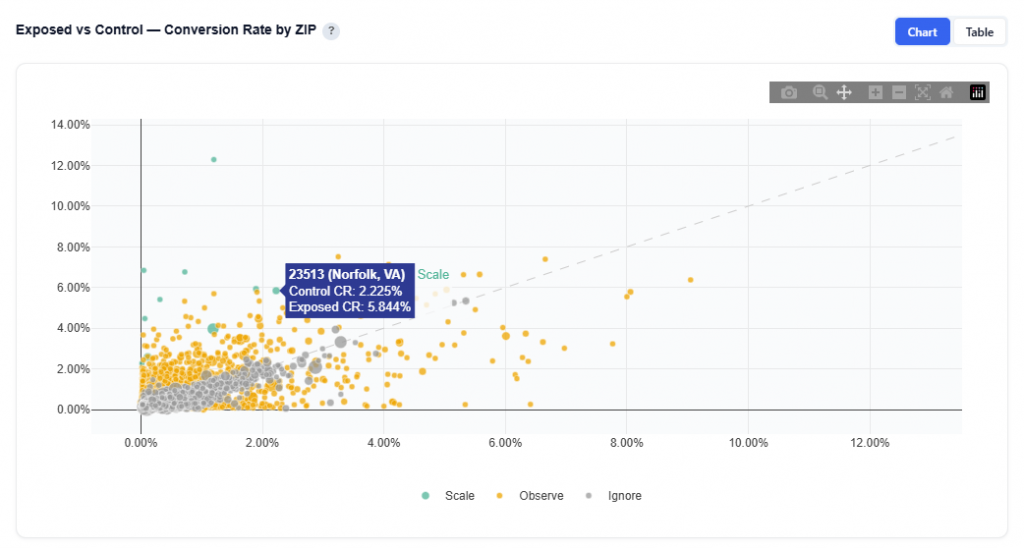
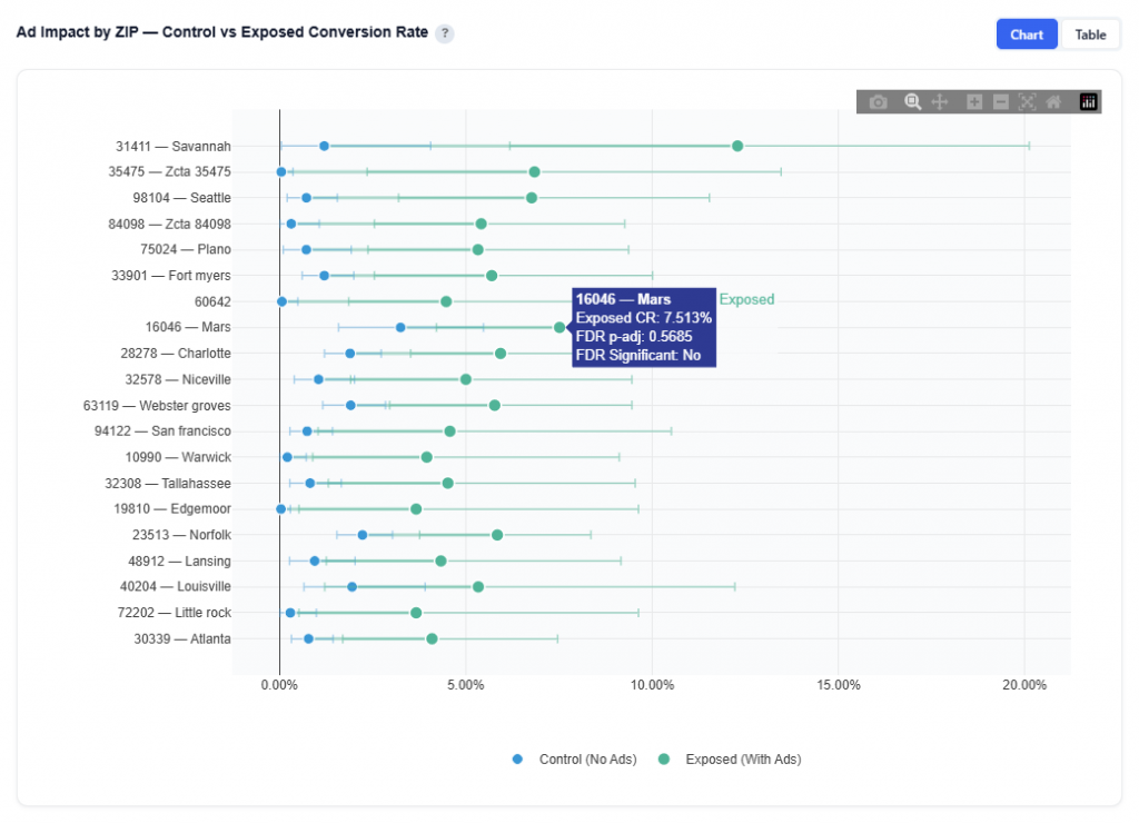
How much of your performance would have happened anyway? The Incrementality tool tells you. By measuring exposed users against a matched control group, it isolates the conversions your media actually caused, giving you a true CPA, statistically validated lift by market, and a clear answer to the question every stakeholder is asking.
Full Analysis — The Complete Picture
Run all three pipelines from scratch or combine existing individual reports into a single unified analysis. Full Analysis gives you everything at once: audience intelligence, delivery optimization, and true incrementality, so you can see the complete story of your campaign performance without piecing it together yourself. One run. Total clarity.
Tip: Save & Rerun the report to automatically refresh and update the model.
No black boxes. No guesswork. Just transparent models, one-click activation, and results you can defend in any room. Select a report to dive deeper into each tool.
Audience Overview
The Audience model uses demographic regression and persona clustering to understand who is most likely to convert. It identifies which census-based features are predictive of performance and groups users into distinct audience segments. All modeling is based on aggregated, privacy-safe data at the ZIP code level, with no use of cookies or personally identifiable information (PII).
The Dashboard tab highlights which census features predict conversions, along with scored ZIP codes and lookalike expansion targets. The Personas tab segments audiences into clusters with shared characteristics and geographic distribution. These insights are currently available for the United States only, leveraging standardized data from the United States Census Bureau to ensure consistency and accuracy.
Use Cases: Understand, Activate, Scale
Understand Your Audience: Define who your customers are and what drives them to convert.
Understand Your Audience Before You Launch (Audience Mode)
Use site visitor data to uncover who your audience is, where they’re located, and what defines them—so you can build smarter strategy before spending media dollars.
Find Where Your Best Customers Are (ZIP List Mode)
Identify high-performing ZIP codes weighted by revenue or LTV to understand what makes them valuable—so you can prioritize the geographies that matter most.
Turn Data into Clear, Actionable Audiences (All Modes)
Segment users into distinct personas with shared traits and geographic patterns—so you can translate data into clear targeting and messaging.
Activate with Confidence: Turn insights into smarter targeting and campaign execution.
Plan Smarter Campaigns with Data-Backed Insights
Use demographic and geographic signals to guide targeting, messaging, and channel strategy—so every campaign is built on what actually drives performance.
Connect Personas to Performance (Campaign / ZIP List Modes)
Link high-performing ZIP codes to persona segments—so you can activate and optimize at the audience level, not just the campaign level.
Scale What Works: Grow efficiently while maintaining performance.
Measure, Learn, and Optimize in Real Time (Campaign Mode)
Analyze past and live campaigns to identify what’s driving conversions—then optimize targeting and spend while campaigns are running.
Scale What Works with Lookalike Expansion (Campaign / ZIP List Modes)
Use top-performing audiences or geographies to find similar, high-potential segments—so you can expand reach without sacrificing efficiency.
New Report Set Up
Choose how you want to analyze your audience, whether through campaign performance, site visitors, or custom ZIPs, then configure dates, optimization type, and inputs to generate the report results and model.
Instructions for generating a Audience Report and Model. Follow the steps for initial setup below:
Navigate to the Audience Tab.
Click New Report button.
Give report a name.
Select the Advertiser to run the analysis on.
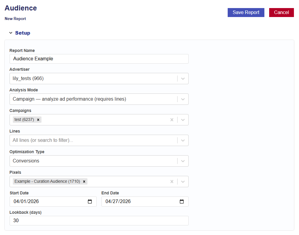
Select the Analysis Mode:
Campaign – analyze ad performance based on campaign delivery.
Requires campaigns and lines with media served.
Identifies which audiences and demographics drive conversions.
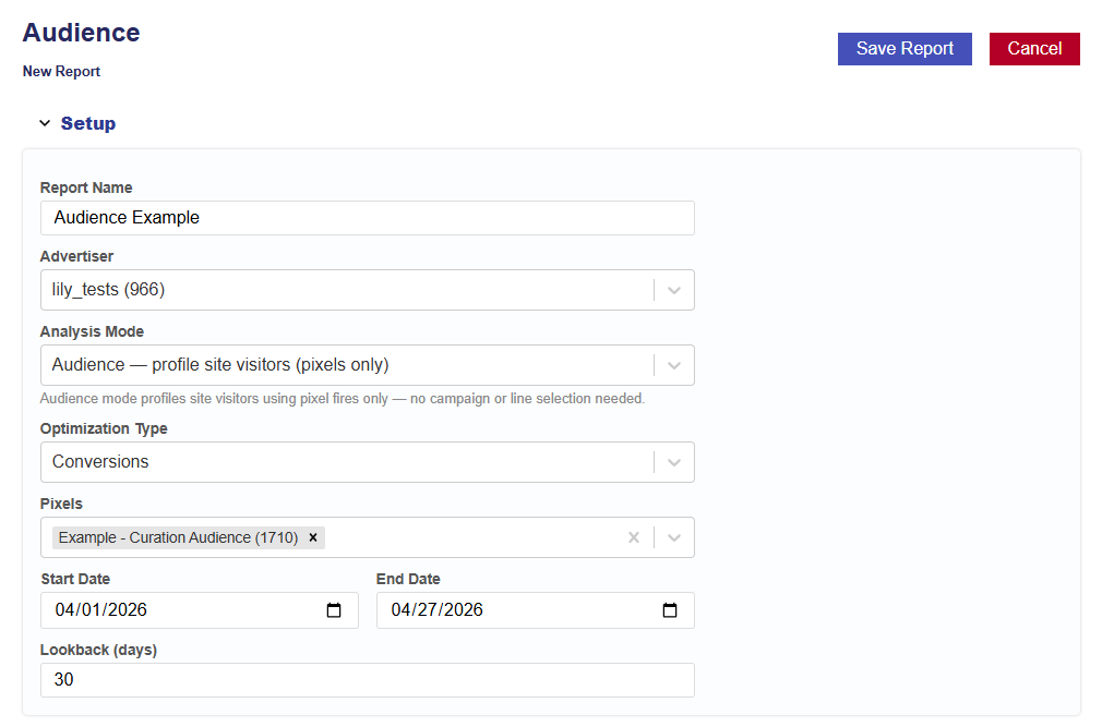
Audience – profile site visitors using pixel data only.
Requires pixel fires on the advertiser’s site.
No campaign or line selection required.
Tip: Can be used for pre-campaign analysis to understand your audience before launch.
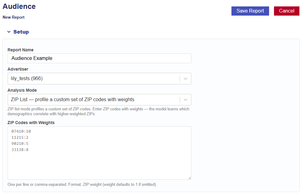
ZIP List – profile a custom set of ZIP codes with weights.
Model learns which demographics correlate with higher-weighted ZIPs.
Tip: Useful for profiling ZIPs based on sales, revenue, or LTV.
Campaign Mode Example
After selecting Campaign Mode, complete the following:
Select the Campaign(s) within the chosen Advertiser.
If no campaigns are selected, all campaigns will be included.
Select the Line(s) within the chosen Campaign(s).
If no lines are selected, all lines will be included.
Select the Optimization Type:
Conversions
If selected, choose the conversion pixel to be used for optimization.
Clicks
Select the analysis Start Date.
Select the analysis End Date.
Enter the desired lookback window (in days).
Default is 30 days.
This defines how far back the model will attribute conversions or clicks to ad exposure.
Click the Save Report button.
Audience Mode Example
After selecting Audience Mode, complete the following:
Select the Optimization Type:
Conversions
If selected, choose the conversion pixel to be used for optimization.
Clicks
Select the analysis Start Date.
Select the analysis End Date.
Enter the desired lookback window (in days).
Default is 30 days.
This defines how far back the model will attribute conversions or clicks to ad exposure.
Click the Save Report button.
ZIP List Mode
After selecting ZIP List Mode, completed the following:
Enter ZIP codes with weights.
One per line or comma-separated. Format: ZIP:weight (weight defaults to 1 if omitted).
Example input: 11215:2, 33138:8
Click the Save Report button.
Report Results
The report results include the pipeline used, date created, when the report started, and when the report completed. The output is separated into 7 sections:
Summary
Dashboard
Lookalike
Personas
Explorer
Charts
Downloads
This information provides a complete audit trail and transparency into the model, allowing users to understand how insights are generated and tie them back to audience behavior and performance, rather than relying on a black-box approach.
Summary
The Summary section provides a high-level overview of the analysis, including the Report ID, Advertiser ID, and Date Range, along with an automatically generated Executive Summary.
This summary explains:
Key demographic drivers of conversions
Audience composition and persona breakdown
Geographic performance and distribution
Lookalike expansion opportunities (if applicable)
Strategic recommendations and action items
Tip: You can input the Executive Summary into your preferred LLM (e.g., ChatGPT or Claude) to quickly generate a presentation deck or case study based on the results.
Dashboard
The Dashboard section provides a visual overview of audience composition and demographic drivers of performance. It highlights which census-based features influence conversions, how audiences are distributed geographically, and how different demographic segments perform.
Dashboard Sections:
Tile Metrics
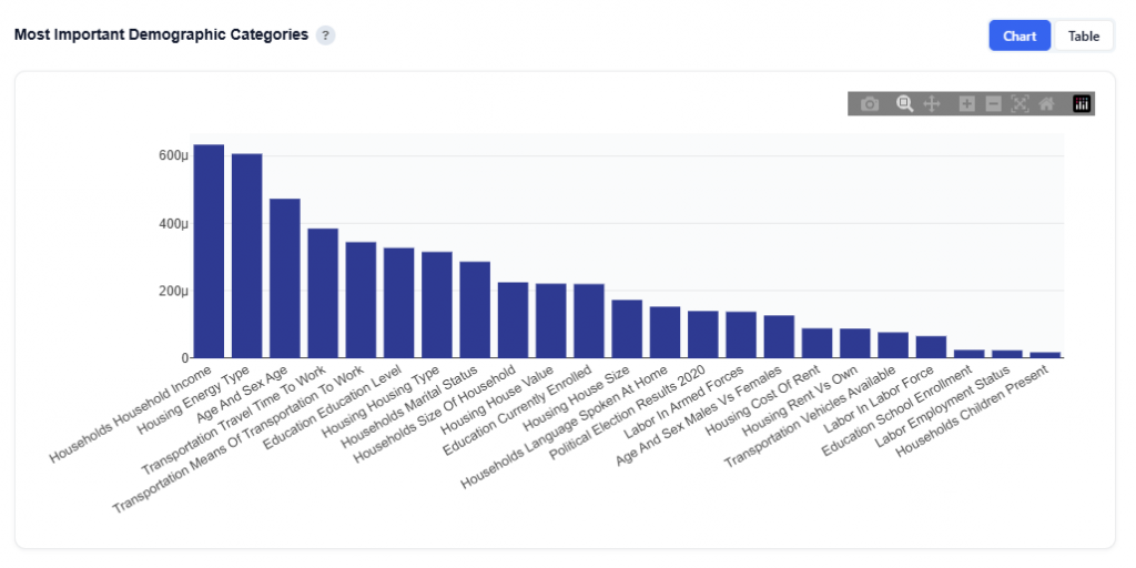
Most Important Demographic Categories
Feature Impact Distribution — SHAP Beeswarm
Demographic Sub-Feature Impact
Shows the top three most important features based on your audience dynamically.
Geographic Performance — Click a State to See ZIP Codes
Cost per Conversion by Demographic Category
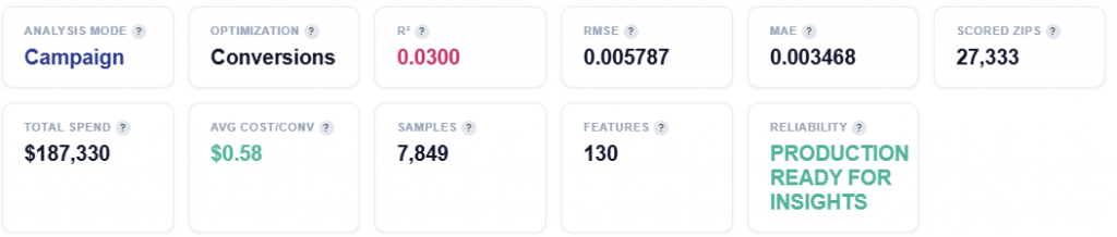
Tile Metrics
Analysis Model: Campaign Mode — results are based on ad-attributed conversions. Impressions served by your lines that led to pixel fires within the lookback window. The model learns which demographics respond to your ad.
Optimization: Conversions or Clicks
Conversions: Optimizing for conversions (pixel fires). The model predicts which demographics drive conversion events.
R² (Coefficient of Determination): Measures how much of the conversion rate variance is explained by demographics. 5–15% is typical. Demographics are just one signal among many.
RMSE (Root Mean Squared Error): Lower is better. Measures the average prediction error in the same units as the target (conversion rate).
MAE (Mean Absolute Error): Average absolute difference between predicted and actual conversion rates. Less sensitive to outliers than RMSE.
Scored ZIPs: Total ZIP codes scored with demographic affinity. Example: 1,850 positive, 25,483 negative or zero (this figure changes dynamically).
Total Spend: Total ad spend across all campaign ZIPs in this analysis period.
Avg Cost/Conv: Average cost per conversion across all campaign ZIPs. Lower is more efficient.
Samples: Number of ZIP codes included in the analysis after filtering for (>300 events) and outlier removal.
Features: Number of census demographic features used by the model.
This section shows the total SHAP importance aggregated by demographic category, helping identify which broad demographic dimensions have the greatest influence on the model’s conversion rate predictions. Use this to understand which broad demographic dimensions matter the most.
Chart View
What It Shows:
Each bar represents a demographic category (e.g., Household Income, Age, Housing, Transportation)
Bar height reflects total SHAP importance across all features within that category
Interpretation:
Taller bars indicate categories that have a greater impact on the model’s predictions
Categories at the top represent the strongest drivers of conversion likelihood
Lower bars indicate categories with less influence on performance
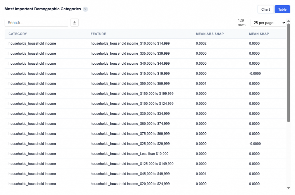
Table View
Provides a detailed breakdown of individual features within each demographic category, including:
Category: High-level demographic group
Feature: Specific sub-feature (e.g., income bracket, age range)
Mean Abs SHAP: Overall importance of the feature
Mean SHAP: Direction of impact (positive or negative influence)
Users can download this table as a CSV file for further analysis.
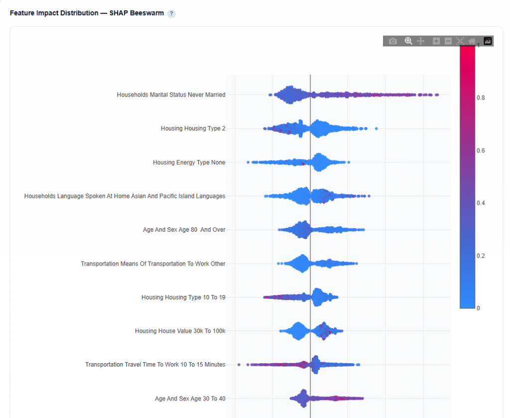
Feature Impact Distribution — SHAP Beeswarm
This section shows how each demographic feature impacts conversion predictions across all ZIP codes.
What It Shows:
Each dot represents a single ZIP code prediction
X-axis shows SHAP value (impact on predicted conversion rate)
Color represents the feature value:
Red = higher values
Blue = lower values
Features are ordered by importance (top = most important)
Interpretation:
Points to the right increase predicted conversion rate
Points to the left decrease predicted conversion rate
Color helps identify whether higher or lower values drive performance
Clusters indicate consistent impact patterns across ZIP codes
Wide spread shows variable impact, while tight clusters show consistent behavior
Example Interpretation: This audience skews toward non-married individuals and people aged 30 to 40, who are more likely to convert, while higher-density housing areas tend to underperform.
Households Marital Status: Never Married
Takeaway: Prioritize ZIPs with higher concentrations of never-married populations as this is a strong positive signal for conversion.
Many points extend to the right, indicating this feature often increases predicted conversion rate
Higher values (red) are more concentrated on the right, showing that higher concentrations of never-married populations drive performance
The distribution is relatively wide, meaning the impact varies across ZIP codes
Visible clustering suggests consistent positive patterns in certain regions
Housing Type 10 to 19
Takeaway: Deprioritize areas with high concentrations of this housing type (mid- to high-density housing such as apartments or condos). Lower concentrations tend to perform more consistently.
Points are distributed on both sides of zero, indicating this feature can both increase and decrease predicted conversion rate
Red values (higher concentrations) extend more to the left, showing that higher values tend to decrease conversion likelihood
Blue values (lower concentrations) are more clustered on the right, indicating lower values tend to increase conversion likelihood
The spread is moderately wide, suggesting variable impact across ZIP codes
Clusters near the center indicate more neutral or mixed performance overall
Age 30 to 40
Takeaway: This is a stable, reliable positive signal and a good baseline demographic to include in targeting.
Points lean slightly to the right, indicating a generally positive impact on conversion rate
Higher values (red) tend to appear more on the right, suggesting higher concentrations in this age group improve performance
The distribution is more tightly clustered, indicating a more consistent effect across ZIP codes
Less spread means this feature behaves more predictably compared to others
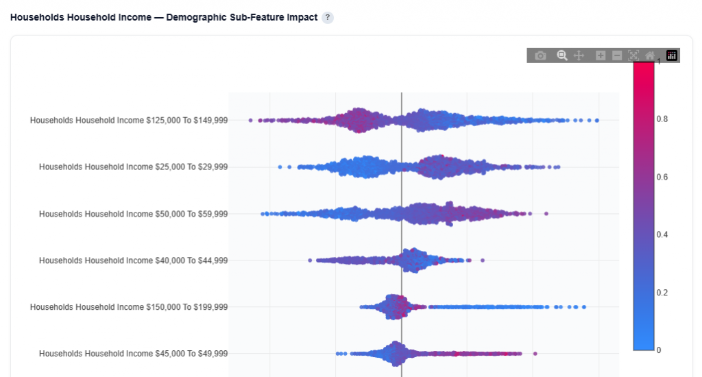
Demographic Sub-Feature Impact
This section breaks down a top demographic category into its individual sub-features to show how each one influences conversion predictions.
Household Income Example
This chart is a SHAP Beeswarm for the Household Income category.
What It Shows:
Each dot represents a ZIP code prediction
Each row represents a specific sub-feature
X-axis shows SHAP value (impact on predicted conversion rate)
Color represents the feature value:
Red = higher values
Blue = lower values
Features are ordered by importance (top = most important)
Interpretation:
Points to the right increase predicted conversion rate
Points to the left decrease predicted conversion rate
Color helps identify whether higher or lower values drive performance
Clusters indicate consistent impact patterns across ZIP codes
Wide spread shows variable impact, while tight clusters show consistent behavior
Example Interpretation: This audience skews toward low to mid-income households, which are more likely to convert than higher-income segments.
Household Income $125,000 to $149,999
Takeaway: Higher concentrations of this income group tend to decrease conversion likelihood, while lower presence performs better.
Red points (higher values) are concentrated left of zero, indicating a negative impact
Blue points extend more to the right, showing lower concentrations improve performance
Wide spread indicates variable impact across ZIP codes
Household Income $25,000 to $29,999
Takeaway: This income bracket is a strong positive signal when present at higher levels.
Red points cluster to the right, indicating higher values increase predicted conversion rate
Blue points appear more on the left, showing lower values reduce performance
Moderate spread suggests some variability, but generally consistent direction
Household Income $50,000 to $59,999
Takeaway: A strong and reliable positive segment worth prioritizing.
Red points are clearly right-skewed, showing higher concentrations drive conversions
Blue points are more left or neutral, indicating weaker performance when absent
Wider spread shows impact varies, but direction is consistently positive
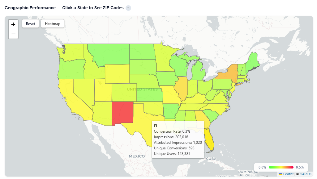
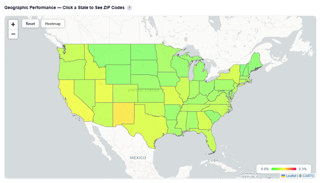
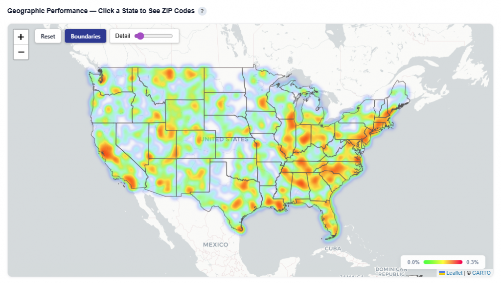
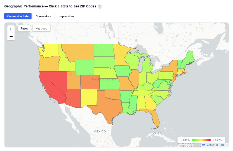
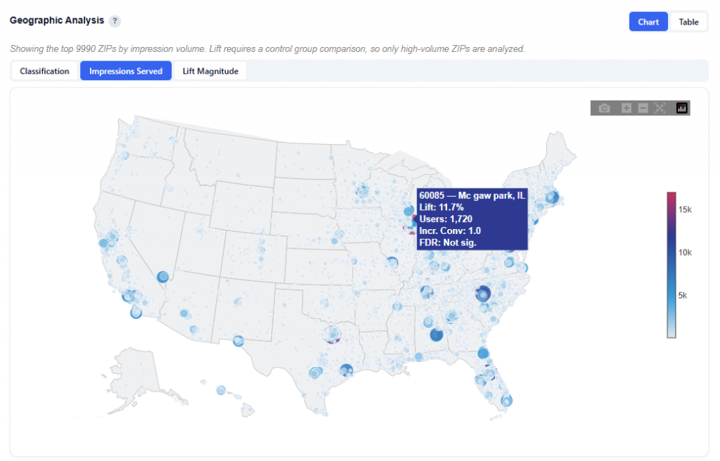
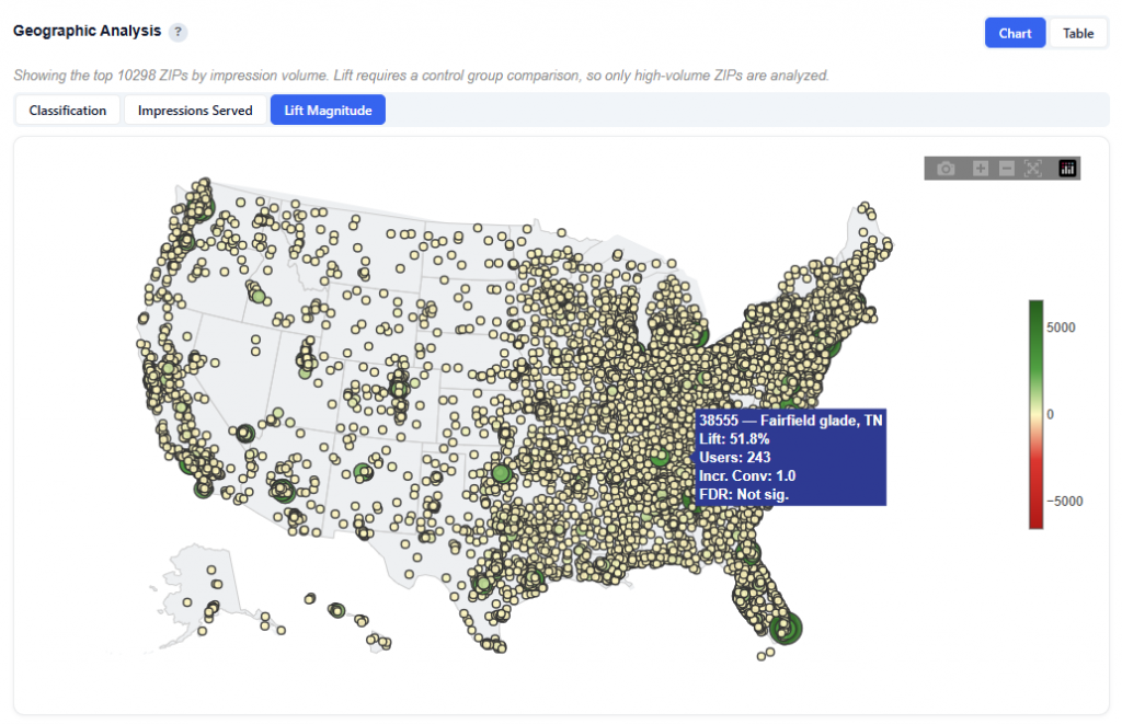
Geographic Performance — Click a State to See ZIP Codes
This section provides an interactive map of conversion performance by geography, helping identify where your audience is performing best.
What It Shows:
States and ZIP codes colored by conversion rate
Visual distribution of performance across regions and local markets
Ability to analyze performance at both state and ZIP-level
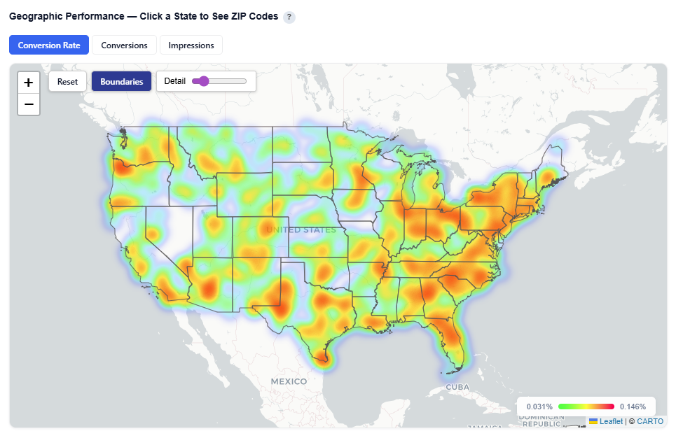
Toggle between Heatmap and Boundaries view:
Boundaries: Clearly outlines geographic regions
Heatmap: Highlights performance intensity across regions
Boundaries View
Heatmap View
Interactions:
Hover over a state to view:
State Name
Conversion Rate
Impressions
Attributed Impressions
Unique Conversions
Unique Users
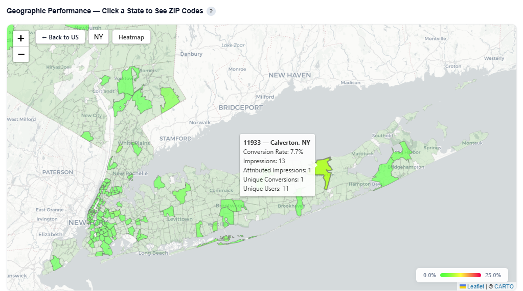
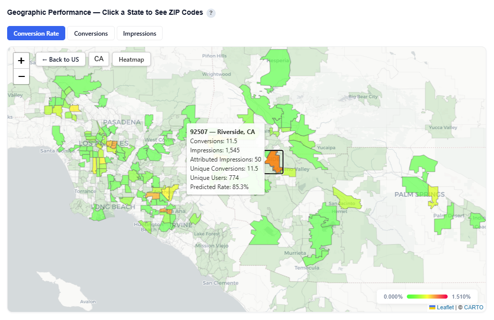
Click a state to drill down into ZIP level performance – Zip code view:
Zip code
Zip code name
Conversions
Impressions
Attributed Impressions
Unique Conversions
Unique Users
Predicted Rate
Zip Code View
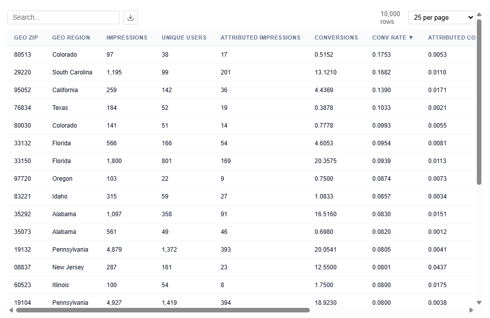
Table View
This table contains the underlying data used to power the Geographic Performance map, providing detailed metrics at the ZIP code level. Users can download this table as a CSV file for further analysis.
Each row represents a ZIP code and its associated performance, which is aggregated to render state-level views in the map.
What It Includes:
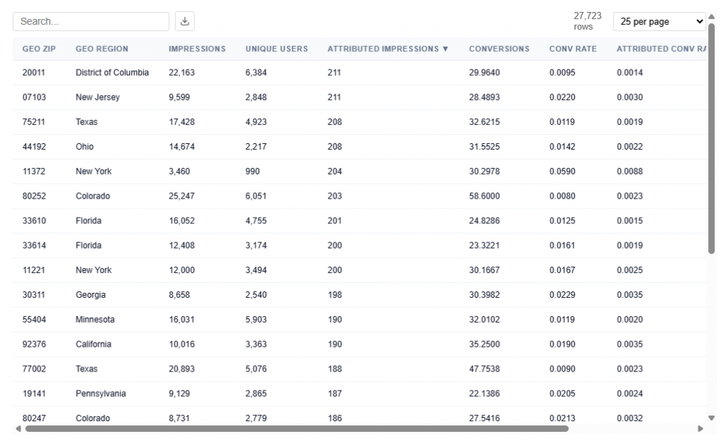
Geographic identifiers
Geo Zip
Geo Region Name
City
State ID
Delivery Metrics
Impressions: Total number of times ads were served
Attributed Impressions: Impressions tied to users who later converted within the lookback window
Unique Users: Number of distinct users exposed to ads
Performance Metrics
Conversions: Total number of conversion events attributed to the campaign
07103 (NJ) shows a Conversion Rate (2.20%) and Attributed Conversion Rate of 0.30%, indicating performance well above average (0.077% conversion rate from Executive Summary for this data).
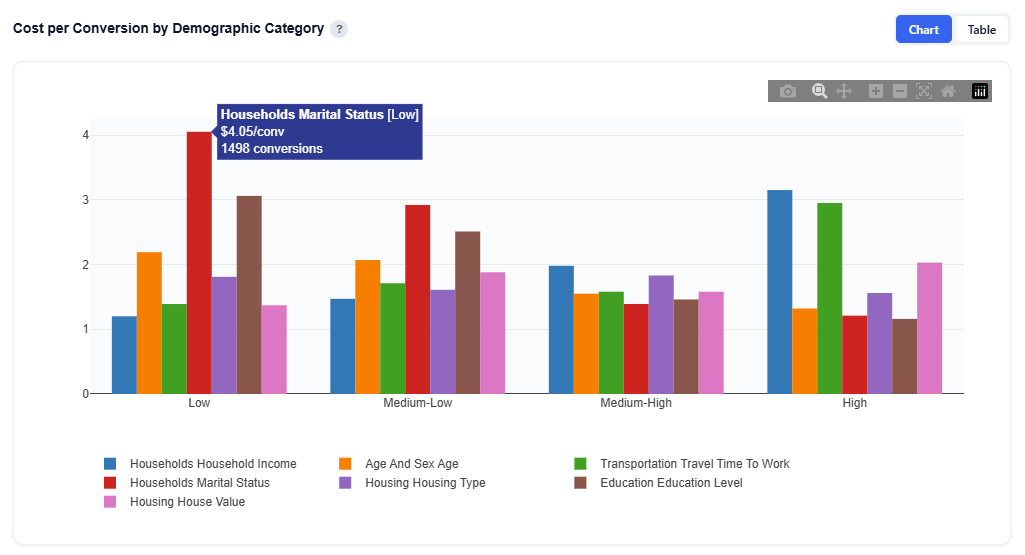
Cost per Conversion by Demographic Category
This section shows how cost efficiency changes based on how strongly a demographic category is represented in a ZIP, helping identify which types of areas deliver the best ROI.
What It Shows:
Each demographic category (e.g., Income, Age, Marital Status) is broken into quartiles based on its most important sub-feature
Each bar represents a quartile segment (Low to High)
Bar height represents cost per conversion (CPA)
Interpretation:
Lower bars = cheaper conversions (more efficient)
Higher bars = more expensive conversions (less efficient)
Compare across quartiles to see how performance changes as the concentration of the demographic increases or decreases within a ZIP
Differences across categories show which demographic dimensions drive efficiency vs. cost
Example Interpretation: Balance scale and efficiency by prioritizing ZIPs with strong marital status and age signals, while reducing spend in areas where income signals increase CPA.
Households Marital Status
Takeaway: ZIPs where this category has a stronger presence are more cost-efficient, while weaker presence is expensive.
The Low quartile has the highest CPA ~$4.05, indicating poor efficiency
CPA decreases steadily across quartiles, with High segments being much cheaper to ~$1.21
Indicates areas where marital status signals are stronger perform more efficiently
Household Income
Takeaway: ZIPs where income-related signals are stronger (based on the model’s top feature) tend to be less cost-efficient.
CPA increases from Low to High quartiles (bins) (~$1.2 to ~$3.15)
Indicates stronger income signal areas are more expensive to convert
Lower-signal areas are more efficient
Age
Takeaway: ZIPs with stronger age-related signals are more cost-efficient.
CPA decreases from Low to High quartiles
Indicates areas where age is more predictive deliver cheaper conversions
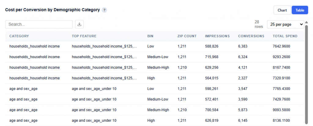
Table View
The table provides the underlying data behind the chart, showing how cost and performance vary across demographic category bins. Users can download this table as a CSV file for further analysis.
What It Shows:
Each row represents a demographic category and its top contributing sub-feature
Data is broken into quartile (bins): Low to High based on how strongly that feature is represented within each ZIP
Columns included:
Category: High-level demographic group (e.g., Household Income, Age, Marital Status)
Top Feature: The most important sub-feature within that category driving the segmentation (e.g., a specific income bracket or age group)
Represents relative concentration of that feature within a ZIP, not the value itself.
Bins are calculated independently for each category based on that category’s top feature.
ZIP Count: Number of ZIP codes in that bin
Impressions: Total impressions delivered across those ZIPs
Conversions: Total conversions generated in those ZIPs
Total Spend: Total media spend across those ZIPs
Lookalike
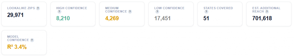
Lookalike targeting uses the trained demographic model to predict conversion rates for all ~33,000 US ZIP codes not in your campaign. ZIPs with demographics similar to your high-performing areas are identified as expansion targets. Confidence tiers reflect prediction reliability — high confidence ZIPs are within the model’s training distribution with consistent predictions across all decision trees.
This section is only available when your campaign is not running nationally and is not already serving all ZIP codes, as lookalike modeling requires out-of-sample areas for expansion.
Tile Metrics
Lookalike ZIPs: Total ZIP codes in the U.S. not in your campaign that were scored for demographic similarity.
High Confidence: ZIPs within the training distribution, with low prediction variance and a positive score. Most reliable for targeting expansion.
Medium Confidence: ZIPs within the training distribution but with higher prediction uncertainty or neutral scores. Consider for testing.
Low Confidence: ZIPs that are demographically different from your campaign/analysis ZIPs (out-of-distribution). Predictions are unreliable. Shown on the map in gray for context, but not recommended for targeting.
States Covered: Number of U.S. states with at least one lookalike ZIP.
Est. Additional Reach: Estimated additional unique IPs reachable in high-confidence lookalike ZIPs. Based on average IPs per campaign ZIP — treat as a rough estimate.
Model Confidence: Model quality weight (e.g., 3.4%). All lookalike scores are dampened by this factor to reflect model uncertainty.
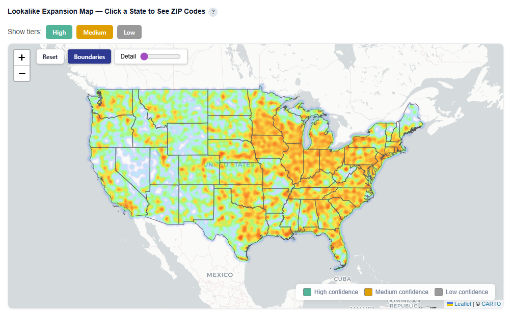
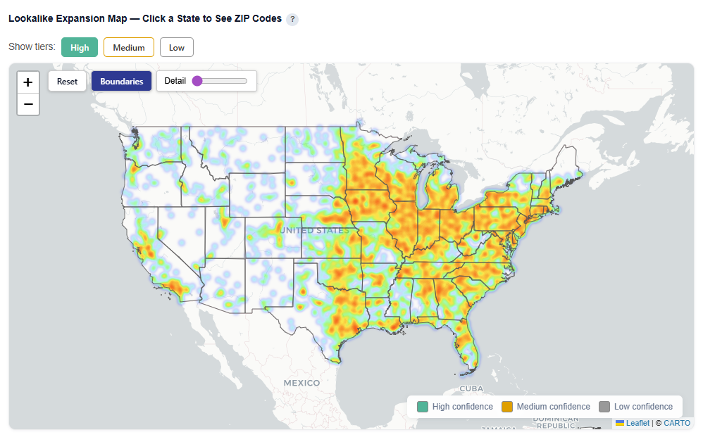
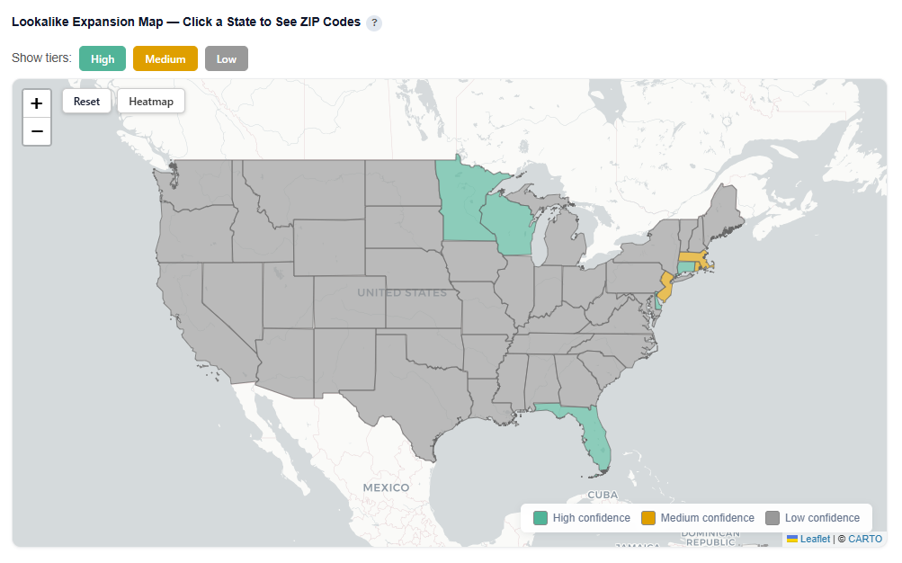
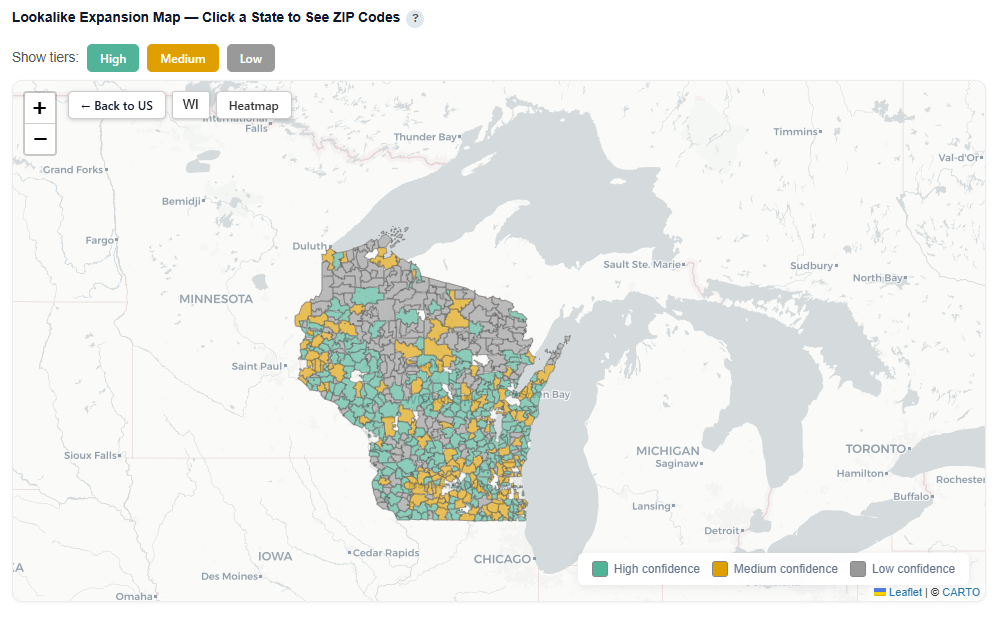
Lookalike Expansion Map — Click a State to See ZIP Codes
This section provides an interactive map of lookalike opportunities, showing where to expand based on demographic similarity to your best-performing ZIPs.
What It Shows:
ZIP codes colored by confidence tier:
High (green): Strongest expansion opportunities
Medium (yellow): Test-and-learn opportunities
Low (gray): Out-of-distribution, not recommended
Geographic distribution of lookalike audiences across the U.S.
Toggle Tiers
Show or hide High, Medium, ad Low confidence ZIPs for easy investigation and comparison.
Toggle Map View
Toggle views:
Boundaries: Clearly outlines ZIP/state regions
Heatmap: Highlights density and intensity of lookalike opportunities
Boundaries View
Heatmap View
Zip Code View
For each state, click onto it so see how the ZIP codes within that specific state map to the confidence tiers.
Lookalike ZIP Details
Full table of lookalike ZIPs sorted by score. Filter by confidence tier, search by city or ZIP. High confidence ZIPs are the safest expansion targets. Users can download this table as a CSV file for further analysis.
Columns:
Geo ZIP: ZIP code being evaluated
Predicted Rate: Model-predicted conversion rate for that ZIP
Prediction Std: Standard deviation of predictions across decision trees
Lower = more consistent predictions
Higher = more uncertainty
Confidence: Model confidence score (0–1) based on prediction stability and similarity to training data
Score: Final model score used for ranking ZIPs
Combines predicted performance and confidence
Higher = better expansion opportunity
Lift vs Avg: Predicted performance relative to campaign average
Positive = above average
Negative = below average
Unique IPs: Estimated number of unique users in that ZIP (if available)
Confidence Tier:
High: Reliable, within training distribution
Medium: Moderate confidence, test recommended
Low: Out-of-distribution, not recommended
Observed Impressions: Number of impressions seen in this ZIP (if any historical data exists)
Needs More Data:
TRUE: Limited data, predictions less stable
FALSE: Sufficient data for more reliable estimates
City: Associated city name
State ID: State abbreviation
Interpretation:
Prioritize:
High confidence, high score, and positive lift are the best expansion targets
Be cautious with:
High score but low confidence should be tested before scaling
Use:
Prediction Std and Needs More Data to gauge reliability
Lift vs Avg to benchmark against current campaign performance
Personas
The Personas section groups your audience into distinct segments using K-means clustering based on shared demographics. It highlights how each cluster performs, what defines it, and where it is concentrated, helping identify the personas that drive the most value.
Persona Sections:
Tile Metrics
Persona Performance — Top 10% vs Next 30% vs Bottom 60%
Audience Clusters — PCA Projection
Geographic Distribution — Click a State to See ZIP Codes
Most Important Characteristics Across Personas
What Differentiates Each Audience — Category Importance
Persona Comparison (Dynamic Top 4 Features)
Shows the most important differentiating features across personas based on your audience’s personas
Per-Audience Deep Dive
Tile Metrics
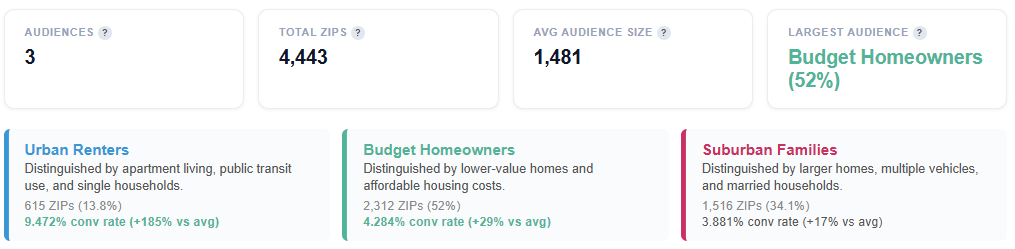
Audiences: Number of distinct audience personas identified by K-means clustering. Each persona represents a group of ZIP codes with similar demographic profiles.
Total ZIPs: Total number of converting ZIP codes that were clustered into audience personas.
Avg. Audience Size: Average number of ZIPs per audience persona.
Large variance may indicate a mix of broad (dominant) and niche (specialized) personas
Largest Audience: Identifies the largest persona segment and its share of total clustered ZIPs.
Includes the top defining trait for that persona
Helps quickly understand the most dominant audience type in your campaign
Persona Tiles: Each tile represents an audience segment with:
A descriptive name
A short explanation of its key distinguishing features
ZIP count and percent of total ZIPs to indicate size
Conversion rate and relative lift vs. average to indicate performance
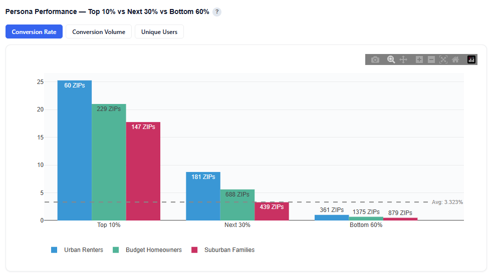
Persona Performance — Top 10% vs Next 30% vs Bottom 60%
This section shows how performance is distributed within each persona by ranking ZIP codes based on conversion rate, conversion volume, or unique users, and splitting them into three tiers.
What It Shows:
Each persona’s ZIPs are ranked based on the selected metric:
Conversion Rate: Efficiency of each tier
Conversion Volume: Total conversions generated per tier
Unique Users: Audience size within each tier
ZIPs are split into three tiers:
Top 10%
Next 30%
Bottom 60%
Bar charts display performance for each persona across these tiers
The gray horizontal dotted line indicates the average conversion rate
Interpretation:
A tall Top 10% bar indicates that a small portion of ZIPs drives a large share of performance
A more even distribution across tiers suggests consistent performance across the persona
The Bottom 60% highlights lower-performing areas or opportunities for optimization
Identifies whether performance is concentrated or evenly distributed within a persona
Helps determine if a persona should be:
Scaled selectively (focus on top-tier ZIPs)
Scaled broadly (consistent performance across tiers)
Enables ZIP-level optimization within each persona
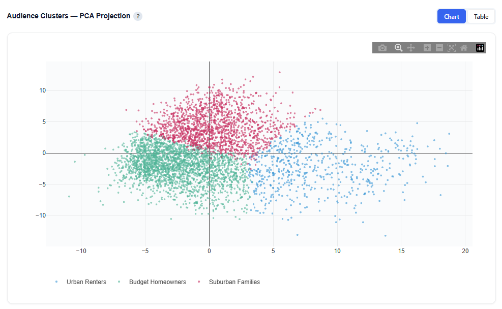
Audience Clusters — PCA Projection
Each dot represents one ZIP code projected into 2D space using Principal Component Analysis (PCA). PCA compresses the 130 demographic features into two dimensions that capture the most variance in the data.
PCA 1 (x-axis) is the single direction that best separates the data. It typically captures the strongest demographic contrast (e.g., urban vs. suburban).
PCA 2 (y-axis) captures the next most important contrast, orthogonal to PCA 1.
Colors represent audience persona assignments. Well-separated groups indicate distinct personas, while overlapping areas suggest shared demographic characteristics.
Chart View
Each point represents a ZIP code
Position reflects similarity in demographic composition
Color indicates persona cluster assignment
Clusters show how clearly personas are differentiated:
Tightly grouped clusters are more consistent personas
Overlapping clusters have more shared characteristics across audiences
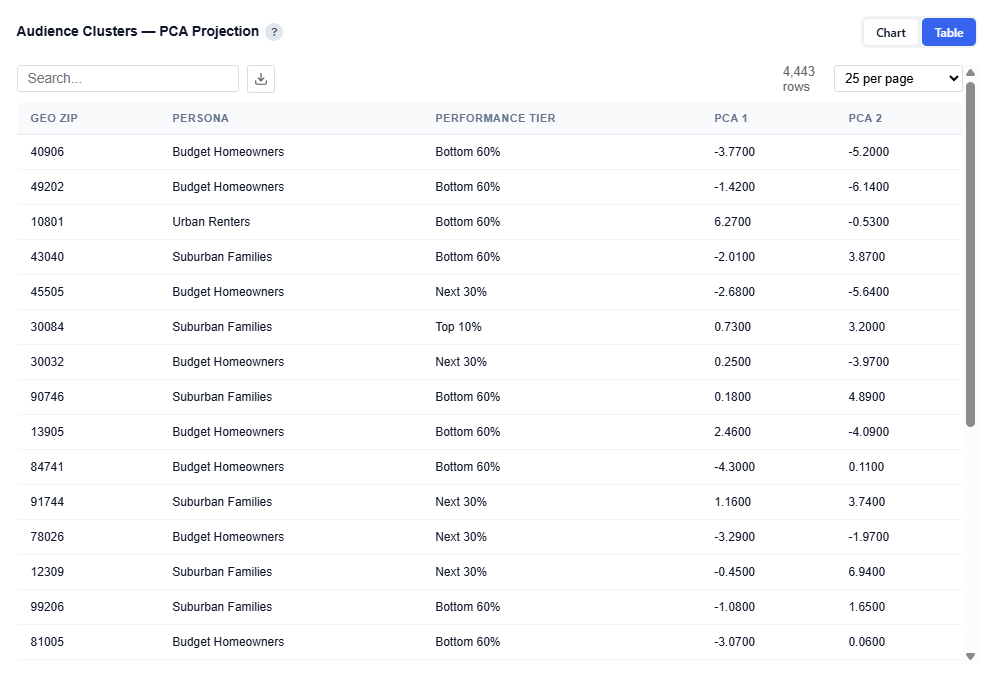
Table View
Provides the underlying data for each plotted ZIP code. Users can download this table as a CSV file for further analysis.
Columns:
Geo ZIP: ZIP Code
Persona: Assigned audience persona name
Performance Tier: Top 10%, Next 30%, or Bottom 60%
PCA 1: X-axis coordinate from PCA projection
PCA 2: Y-axis coordinate from PCA projection
Tip: Download the CSV to easily create ZIP code lists by persona and performance tier, enabling direct activation for targeting, exclusions, or testing strategies.
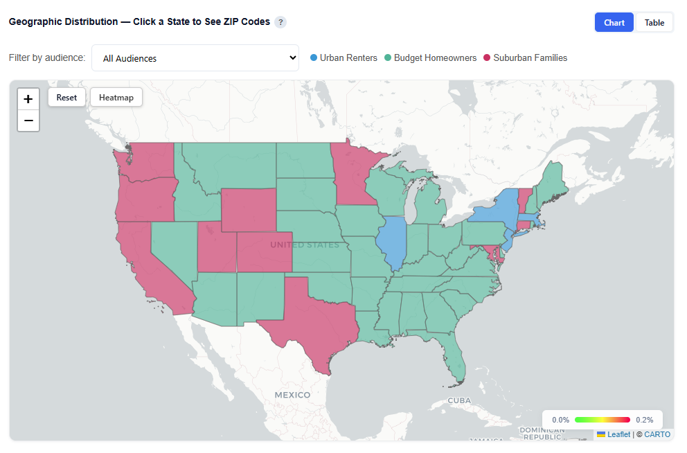
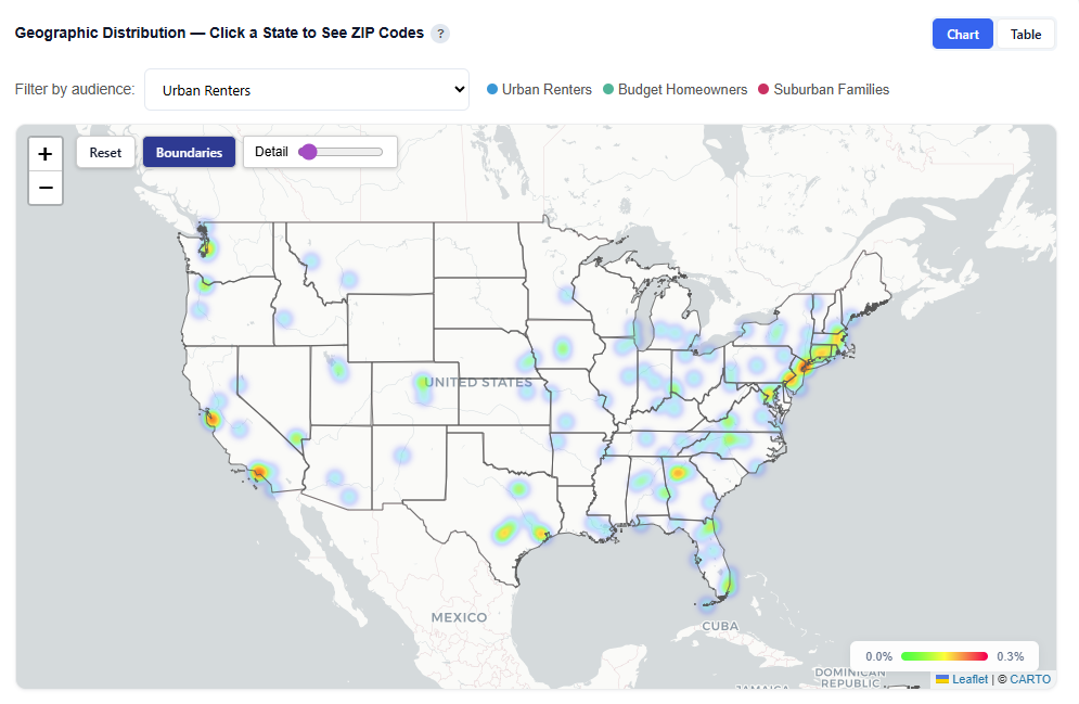
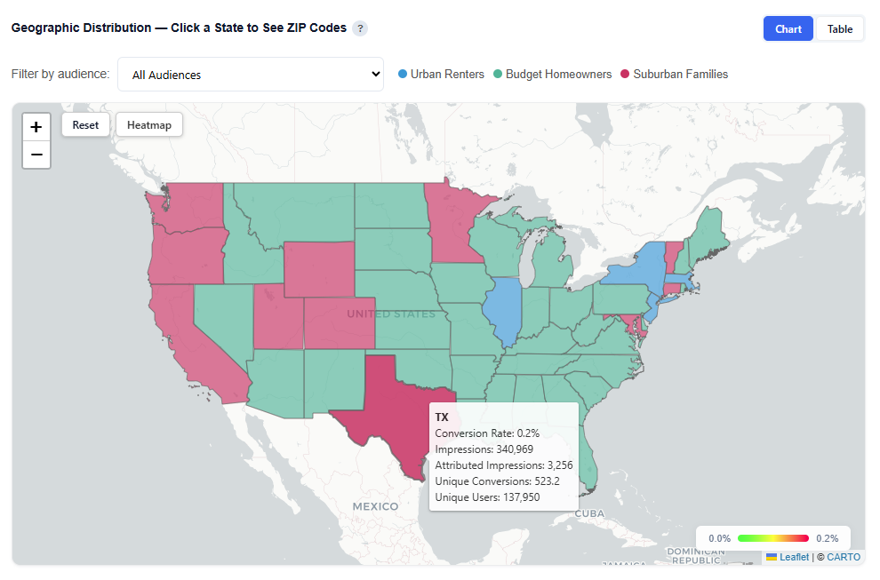
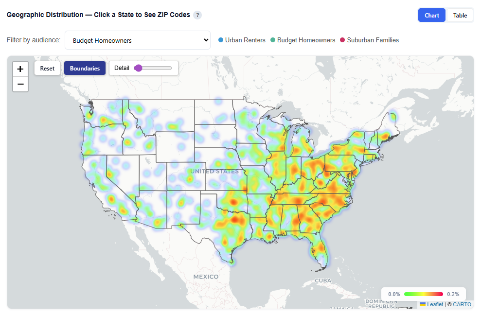
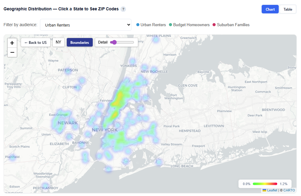
Geographic Distribution — Click a State to See ZIP Codes
This section provides an interactive map showing where each audience persona’s users are located, helping you understand geographic concentration and regional patterns.
What It Shows:
Geographic distribution of users across all combined audience personas and each persona individually
Visual representation of where each persona is most concentrated
Ability to compare geographic footprints across personas
Interactions:
Filter by Audience:
View All Audiences or isolate a specific persona
Toggle Views:
Boundaries: Clearly outlines geographic regions
Heatmap: Highlights user density and concentration
Hover to view ZIP-level details
Conversion Rate
Impressions
Attributed Impressions
Unique Conversions
Unique Users
Click a state to drill down into ZIP-level data
Toggle by Audience
View All Audiences or isolate a specific persona.
Boundaries View
Heatmap View
Zip Code View
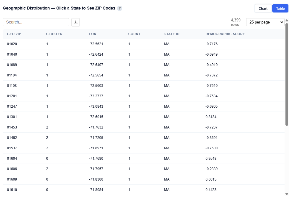
Table View
Provides detailed data for each ZIP code. Users can download this table as a CSV file for further analysis.
Columns:
Geo ZIP: ZIP code
Cluster: Numeric assigned audience persona
Lon: Longitude (geographic coordinate)
State ID: State abbreviation
Demographic Score: Relative strength of demographic alignment for that persona
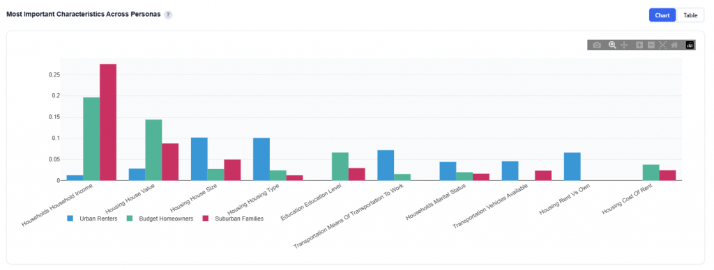
Most Important Characteristics Across Personas
This section compares the top demographic categories across all personas, showing which features are most important in defining each audience segment.
Chart View
What It Shows:
Top demographic categories ranked by overall importance
Each category is displayed with one bar per persona
Bar height represents the importance of that category for that specific persona
Interpretation:
Taller bars indicate that a category is more important in defining that persona
Compare across personas to see which demographics:
Are shared across multiple personas
Are unique drivers for specific audiences
Categories with consistently high bars across personas represent broad drivers, while variation highlights key differences between segments
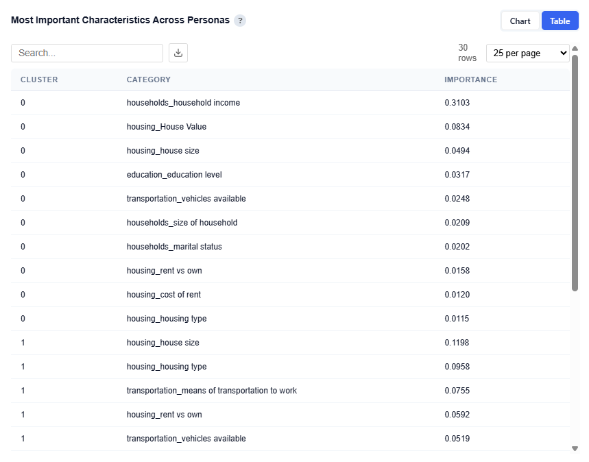
Table View
Provides the underlying data for each persona and its most important demographic categories. Users can download this table as a CSV file for further analysis.
Columns:
Cluster: Persona ID (corresponds to each audience segment)
Importance: Relative importance score of that category for the persona
Higher values indicate stronger influence in defining that persona
Values are comparable within and across personas
This provides a clear view of what drives each persona at a category level, supporting persona naming, messaging, and targeting strategies while validating insights from the chart with precise importance values.
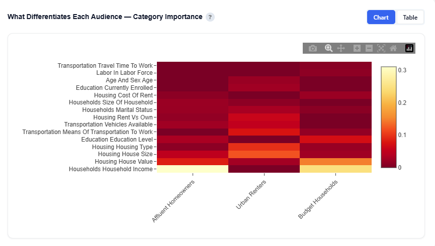
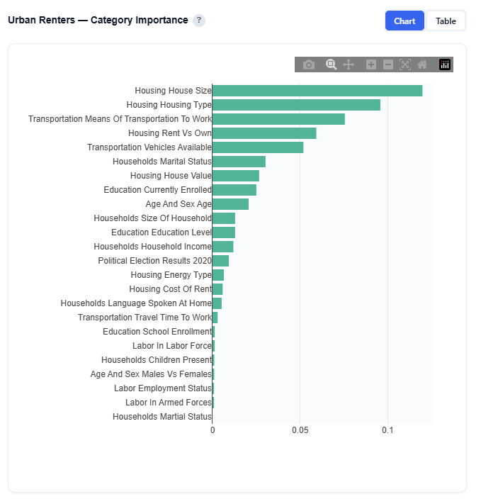
What Differentiates Each Audience — Category Importance
This section highlights which demographic categories (e.g., income, education, age, housing) are most important for distinguishing each audience persona and how their importance differs across personas.
The analysis is based on SHAP values from per-audience Random Forest models, showing which features most strongly define membership in each persona. This presents the same underlying data as the category importance views, but in a heatmap-style, comparative format designed to emphasize how personas differ from one another.
Chart View
Table View
Provides the underlying data behind the heatmap, showing the importance of each demographic category for each audience persona.
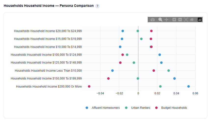
Persona Comparison
This section compares all audience personas across the top 4 most differentiating features, helping highlight how each audience over- or under-indexes relative to the national average.
Household Income Example
Example Interpretation: Household Income
Affluent Homeowners: Strongly over-indexes in higher income brackets.
Positive values for $150K+ and $200K+ indicate this audience skews toward high-income households
Under-indexes in lower income ranges, reinforcing the affluent profile
Urban Renters: Shows a polarized income profile typical of urban markets.
Over-indexes in both $200K+ and less than $10K brackets
Under-indexes across many middle income ranges
Reflects a mix of high-income urban professionals and lower-income renter populations, a common pattern in dense urban areas
Additionally, housing type and house size are more influential for this persona, aligning with an urban renter profile where living structure plays a key role
Budget Households: Skews toward mid-to-lower income ranges.
Positive values for sub-$50K ranges indicate strong presence in lower-income households
Negative values for higher income brackets highlight clear differentiation from affluent audiences
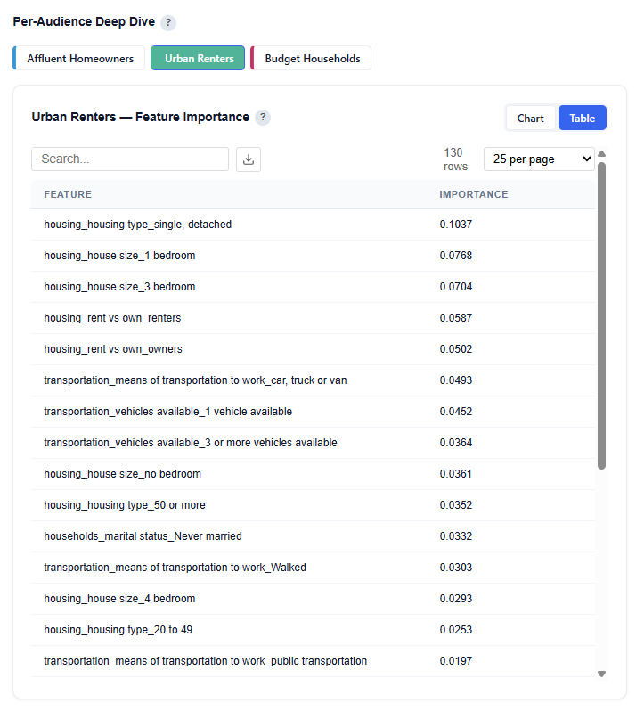
Per-Audience Deep Dive
This section allows you to explore each persona individually, showing what defines the audience and where it is located.
Select a persona to view its feature importance, category-level drivers, SHAP impact, and geographic footprint. Toggle between personas to dynamically update all charts and tables, enabling you to analyze each audience independently and understand its key traits and distribution.
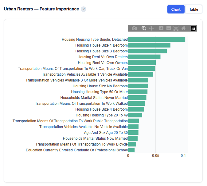
Feature Importance
This subsection shows the top demographic features that distinguish the selected persona from all other audiences. Higher importance means the feature is more useful for identifying members of this persona.
Chart View
Interpretation:
For this persona, housing-related features are the most important drivers, including:
Single, Detached
1 Bedroom
3 Bedrooms
Important Note: These features are the most useful for identifying members of this audience relative to others. Feature importance reflects how useful a feature is for distinguishing the persona, not whether it increases or decreases likelihood of membership. Directional impact (positive vs. negative influence) is shown in the SHAP Impact section.
Table View
Category Importance
This section aggregates feature importance at the demographic category level for the selected persona, showing which broad dimensions are most defining.
Chart View
What It Shows:
Feature importance grouped into categories such as:
Income
Education
Age
Housing
Transportation, etc.
Each category reflects the combined importance of its underlying features
Available in both chart and table views
Interpretation:
Higher values indicate that a category plays a larger role in defining the persona
Compare categories to understand which broad demographic dimensions matter most Helps simplify detailed feature-level insights into high-level driversImportant
Important Note: Category importance reflects how useful a category is for identifying the persona, not whether it increases or decreases likelihood of membership. Directional impact is shown in the SHAP Impact section.
SHAP Impact
Displays the top 3 most impactful features using SHAP Beeswarm charts.
Each dot represents one observation
Color:
Red = high feature value
Blue = low feature value
Position (x-axis):
Right = pushes toward this persona
Left = pushes away
Helps explain how specific features drive membership into the persona.
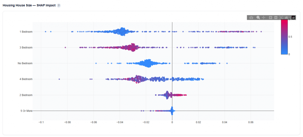
House Size Example
Example Interpretation: House Size
From the Feature Importance chart, 3-bedroom homes appear as one of the top features defining this persona. However, SHAP analysis reveals a more nuanced story.
1 Bedroom: Higher concentrations increase likelihood of belonging to this persona.
Red points extend to the right, showing positive impact on membership
Blue points cluster more to the left, indicating lower values are less aligned
3 Bedrooms: While this feature is important, higher values actually decrease likelihood of belonging to this persona.
Red points (higher values) are concentrated on the left, indicating they push away from this persona
Blue points (lower values) are more centered or slightly right, suggesting lower presence is more aligned with the audience
Feature importance tells you what matters, while SHAP shows how it matters. In this case, although 3-bedroom homes are an important differentiator for Urban Renters, higher concentrations actually reduce the likelihood of belonging to this persona, reinforcing a profile centered around smaller, renter-aligned housing such as apartments and studios.
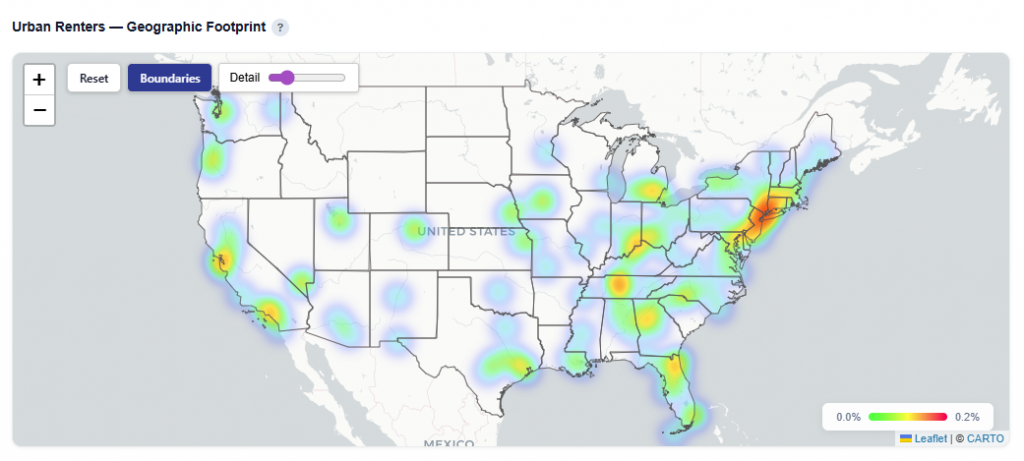
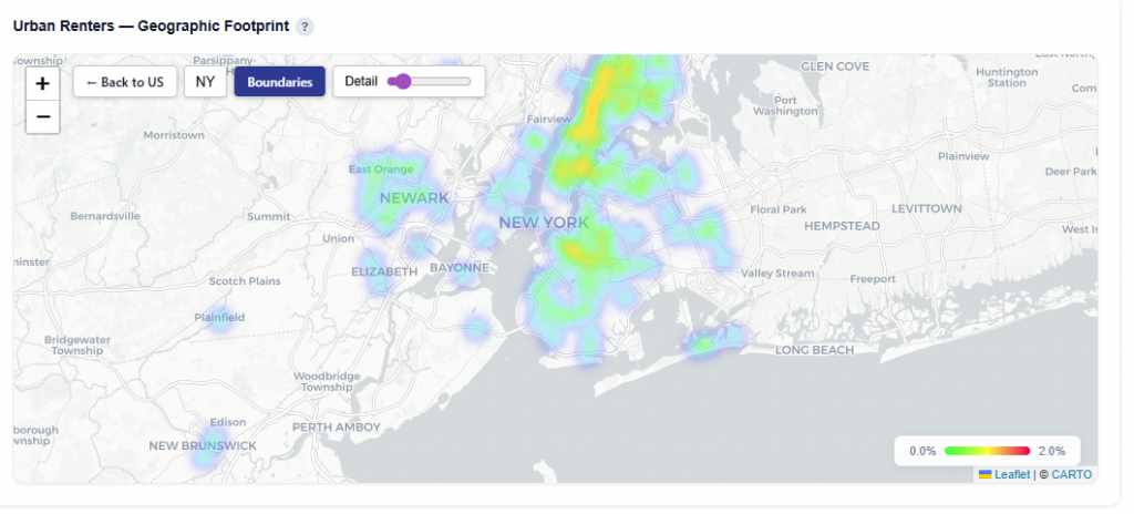
Geographic Footprint
This section shows where the selected persona is geographically concentrated, helping connect demographic insights to real-world locations. Hover over states to see the Conversion Rate, Impressions, and Unique Conversions. Click into each state to drill down.
What It Shows:
States where the persona is present
User density by location, indicating where the audience is most concentrated
Visual distribution of the persona across states and regions
Interactions:
Toggle Views:
Boundaries: Clearly outlines ZIP and state regions
Heatmap: Highlights density and concentration of users
Click a state to drill down into ZIP-level details
ZIP Code and Name
Conversion Rate
Impressions
Attributed Impressions: Impressions that led to a conversion
Unique Conversions
Unique Users
Zip Code View
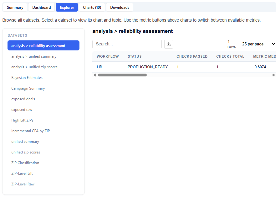
Explorer
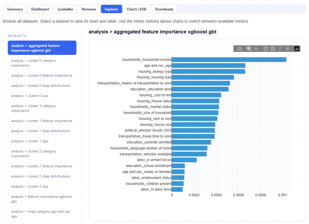
The Explorer tab allows you to browse and interact with all available datasets used in the model. Select a dataset to view its chart and table. Use the metric buttons above charts to switch between available metrics.
What It Does:
Lists all datasets in the left-hand panel
Displays each selection as a chart and table
This section is intentionally extensive and exploratory. Users are encouraged to navigate different datasets and metrics to uncover additional insights.
Charts
The Charts tab provides access to all visualizations generated by the model, organized into categories for easier navigation and analysis.
This section is intentionally extensive and exploratory. Users are encouraged to explore different chart visualizations to uncover additional insights and include in presentations.
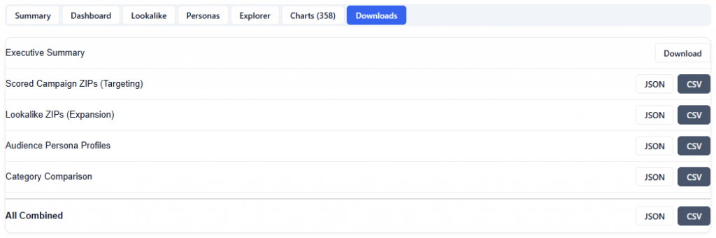
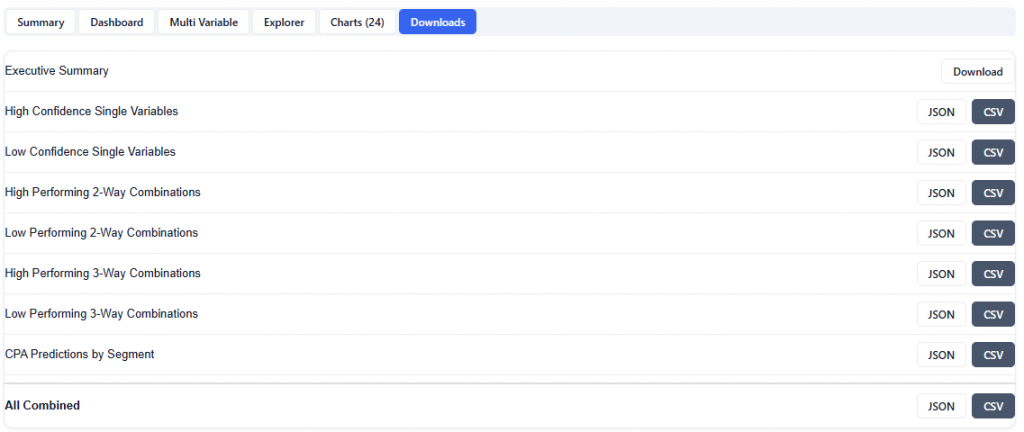
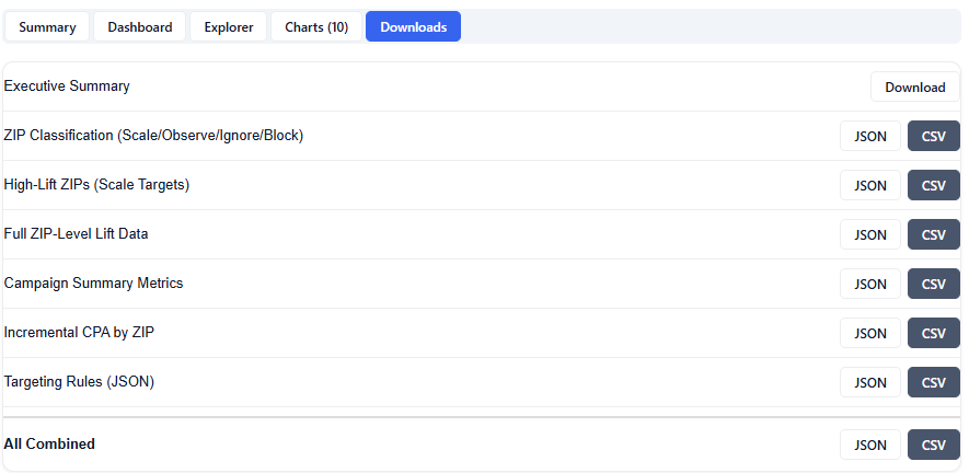
Downloads
The Downloads section provides full access to all model outputs, enabling deeper analysis, reporting, and sharing across teams. These outputs can be used for investigation and validation, but more importantly, the model can be applied directly to campaigns or line items, allowing insights to seamlessly translate into real-time bidding and optimization.
Available Downloads (JSON & CSV):
Executive Summary: High-level narrative of key findings and recommendations
Scored Campaign ZIPs (Targeting): ZIP-level performance and model scores for areas included in the campaign
Lookalike ZIPs (Expansion): Scored ZIPs outside the campaign identified as expansion opportunities
Audience Persona Profiles: Clustered audience segments with demographic and geographic characteristics
Category Comparison: Performance comparison across key demographic categories
All Combined: Full dataset including all outputs for comprehensive analysis
Targeting Overview
The Targeting model analyzes campaign performance to identify which variables and combinations are most strongly driving conversions. It surfaces patterns across inventory, geography, device, and time to help optimize how and where ads are delivered.
Model outputs can be directly applied to lines to improve real-time bidding and delivery efficiency, enabling smarter, more automated optimization.
Use Case Examples
Improve Performance While Campaigns Are Live
Continuously learn from campaign performance and adjust delivery in real time. Improve results without manually breaking out dozens of lines or constantly adjusting targeting.
Reduce Waste and Focus Spend on What Works
Automatically prioritize high-performing impressions and avoid low-value ones, ensuring budget is spent more efficiently over time.
Note:
Optimize towards Conversions or Clicks.
Edit the report/model associate to your Line and click the Save & Rerun button to easily refresh the model
New Report Set Up
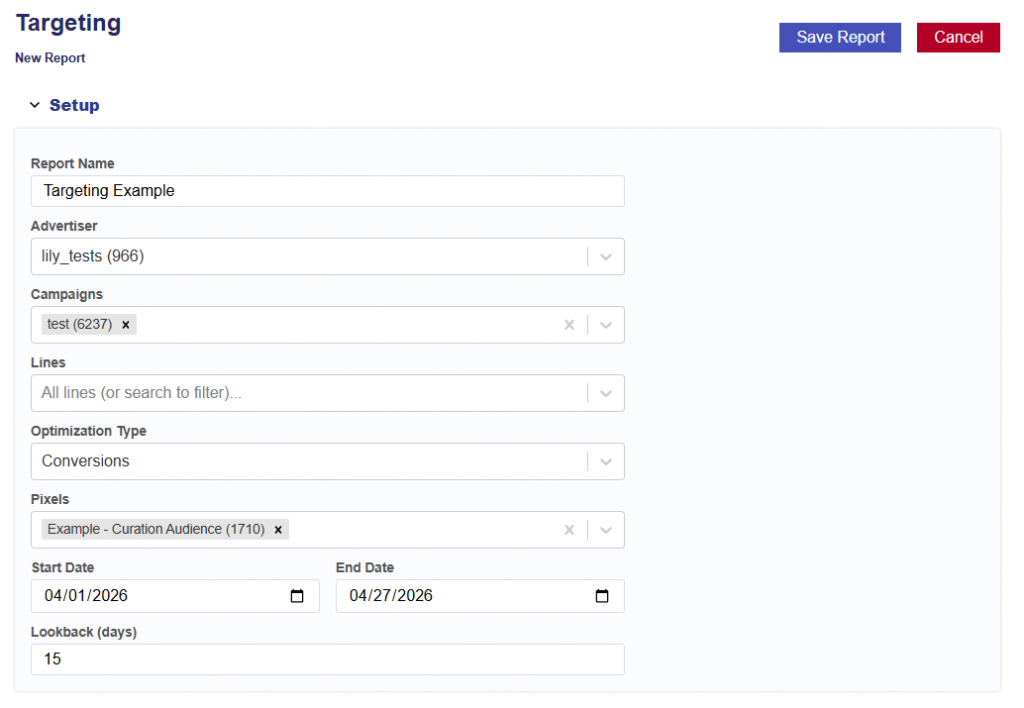
Instructions for generating a Targeting Report and Model. Follow the steps below:
Navigate to the Targeting Tab.
Click New Report button.
Give report a name.
Select the Advertiser to run the analysis on.
Select the Campaign(s) within the chosen Advertiser.
If no campaigns are selected, all campaigns will be included.
Select the Line(s) within the chosen Campaign(s).
If no lines are selected, all lines will be included.
Select the Optimization Type:
Conversions
If selected, choose the conversion pixel to be used for optimization.
Clicks
Select the analysis Start Date.
Select the analysis End Date.
Enter the desired lookback window (in days).
Default is 30 days.
This defines how far back the model will attribute conversions or clicks to ad exposure.
Click the Save Report button.
Additional Notes
Ensure selected campaigns and lines have sufficient data for reliable analysis.
Recommended: ~2,000 conversions for stable model performance.
The lookback window should align with typical user conversion behavior.
Once the report and model are generated, view the results. Users can also edit the report and models setup and rerun the report.
Report Results
The Reports results include the pipeline used, date created, when the report started, and when the reported completed. The output is separated into 6 sections:
Summary
Dashboard
Multi Variable
Explorer
Charts
Downloads
This information provides a complete audit trail and transparency into the model, allowing users to understand how results are generated and directly tie insights back to campaign performance, rather than relying on a black-box approach.
Summary
The Summary section provides a high-level overview of the analysis, including the Report ID, Advertiser ID, and Date Range, along with an automatically generated Executive Summary that explains what is driving performance and helps inform optimization decisions using model-based predictions.
Tip: You can input the Executive Summary into your preferred LLM (e.g., ChatGPT or Claude) to quickly generate a presentation deck or case study based on the results.
Dashboard
The Dashboard section provides a visual overview of campaign performance. It shows which features drive conversions, geographic performance with drill-down maps, temporal patterns, CPA predictions, and the model’s top and bottom performers across all dimensions.
Dashboard Sections:
Tile Metrics
What Drives Conversions – Feature Importance (SHAP)
Feature Impact Distribution
Geographic Performance – Click a State to See ZIP Codes
Geo Zip – Best vs Worst Performers
Device Type – Best vs Worst Performers
Content Genre – Best vs Worst Performers
Conversion Rate by Day of Week
Conversion Rate by Hour
Time to Conversion
Impression Frequency & Conversion Rate
Cumulative eCPA Over Time
Cost Efficiency by Feature
Content Genre
Content Livestream
Day
Device Type
Geo Region
Geo Zip
Hour
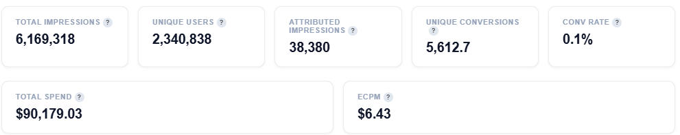
Tile Metrics
Total Impressions: Total Ad impressions served across all geographies.
Unique Users: Unique IP addresses reached.
Note that IP does not equal a person. Shared IPs (Households, offices, etc.) mean actual reach may differ.
Attributed Impressions: Impressions that were part of a conversion path. Multiple impressions can contribute to the same conversion.
Total Spend: Total media cost for the reports date range.
ECPM: Effective cost per thousand impressions.
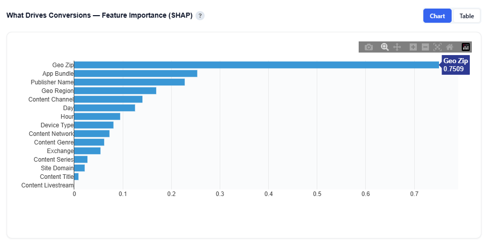
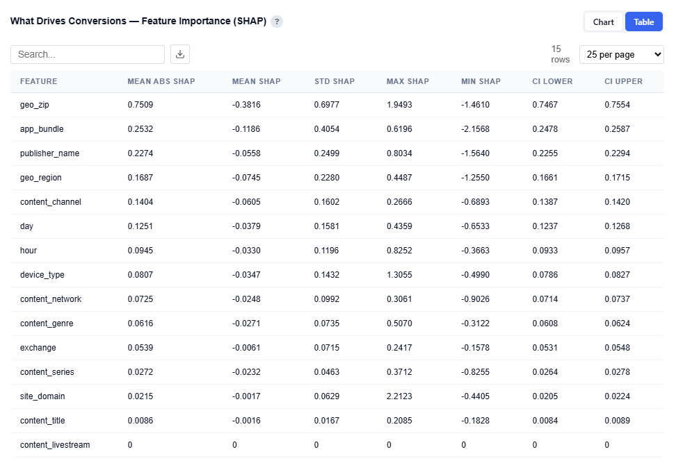
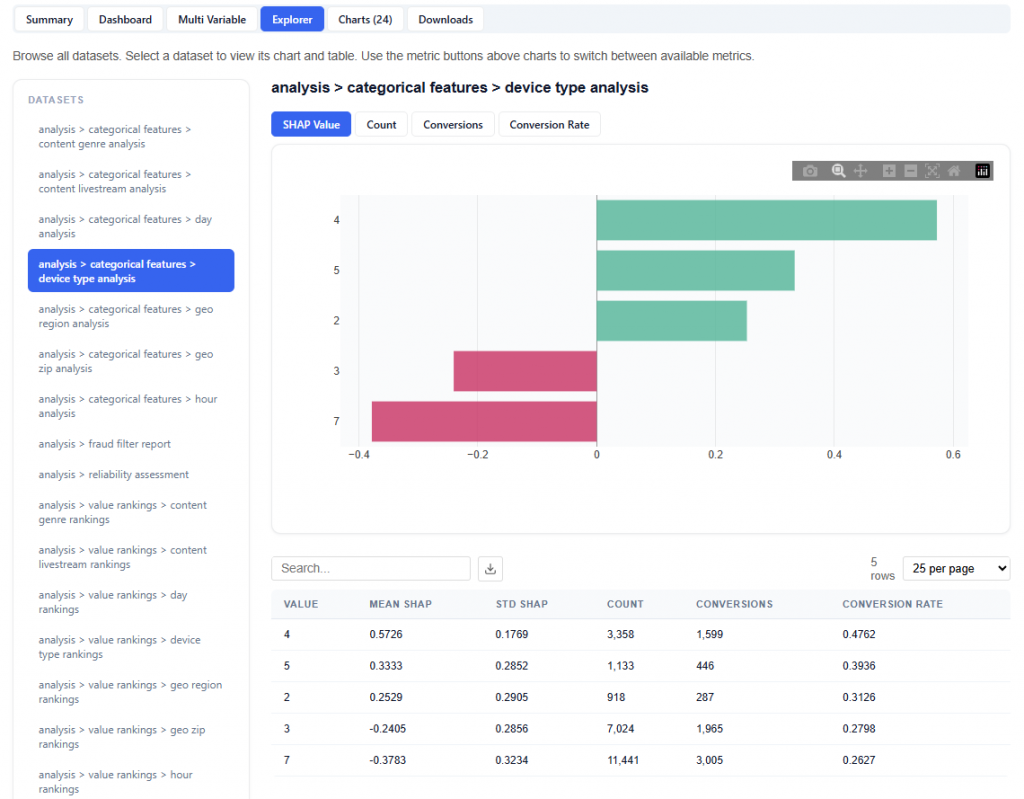
What Drives Conversions – Feature Importance (SHAP)
At a high level, this section shows which factors matter most, which helps you quickly focus on the biggest drivers of performance. If certain features are not shown, it means they were not included in the report and did not have a statistically meaningful impact on the model.
Chart View
This view ranks the factors that have the greatest impact on conversions based on the model’s analysis. It uses SHAP (Shapley values) to quantify how much each feature contributes to performance.
In the above example, features such as Geo Zip, Device Type, Content Genre, Day, Geo Region, Hour, and Content Livestream are ranked by their impact on conversions, where higher values indicate a stronger influence on outcomes. Hover over the bar chart to see the features mean absolute SHAP value.
Example insight from the above model:
Geo Zip is the strongest driver
Followed by App Bundle, then Publisher Name, and Geo Region
Table View
Provides detailed statistics for each feature:
Mean Abs SHAP: Overall importance (primary ranking metric)
Mean SHAP: Direction of impact (positive or negative influence)
STD SHAP: Variability across observations
Max / Min SHAP: Range of impact
Confidence Intervals (CI Lower / Upper): Stability and reliability of the importance score
Users can download this table as a CSV file for further analysis.
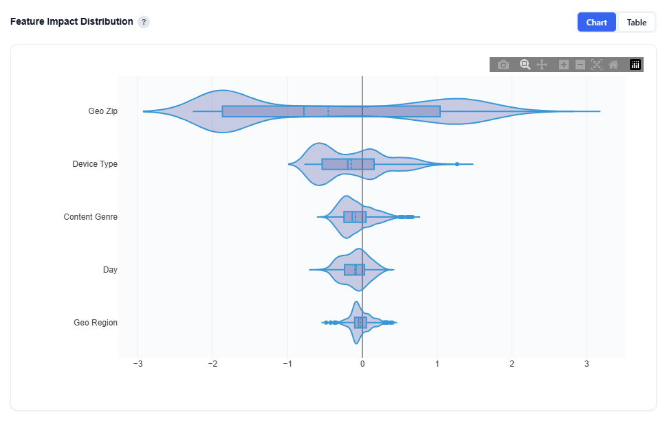
Feature Impact Distribution
At a high level, this section shows how each feature influences conversions directionally across all predictions, not just how important it is.
Chart View
Each violin represents the distribution of SHAP values for a feature:
Wide Spread: more predictions fall at that impact level
Right of zero: pushes toward conversion
Left of zero: pushes away from conversion
The box inside each violin shows:
Median: Center line
Quartiles: Interquartile range of typical values
How to Interpret:
Wide spread: Feature impact varies significantly across observations
Centered Near Zero: Limited average influence on predictions
Skewed Right: Generally contributes positively to conversion
Skewed Left: Generally contributes negatively to conversion
Example insights from the above model:
Geo Zip has the widest spread, ranging roughly from -3 to +3, with density on both sides of zero.
This means geography can both strongly increase and decrease conversion likelihood depending on the ZIP—it’s highly impactful but varies significantly across users.
Device Type is mostly concentrated between -0.5 and +1.5, with more density on the positive side.
This indicates device generally has a positive influence on conversions, but with moderate variability.
Content Genre is tightly clustered around 0 to +0.5, slightly right-skewed.
This suggests a consistent but smaller positive effect on conversion likelihood.
Day is centered very close to zero with a narrow spread (roughly -0.3 to +0.3).
This indicates limited overall impact, with only minor variation by day.
These insights reflect how the model predicts conversion likelihood and help explain what is driving those predictions. The resulting prediction scores are then used to inform bidding decisions, where impressions above or below defined thresholds influence whether the system chooses to bid in real time.
Table View
This table contains the same data as the What Drives Conversions — Feature Importance (SHAP) section and is available for download for further analysis.
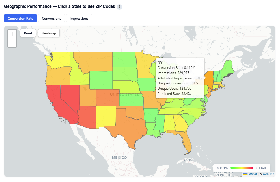
Geographic Performance – Click a State to See ZIP Codes
This section provides an interactive map view of campaign performance by geography, allowing you to quickly identify high- and low-performing regions.
What It Shows:
Performance by State, with the ability to drill down into ZIP code level data
Toggle between key metric views:
Conversion Rate
Conversions
Impressions
Toggle between Heatmap and Boundaries view
Boundaries: Clearly outlines geographic regions
Heatmap: Highlights performance intensity across regions
Boundaries View
Heatmap View
Interactions:
Hover over a state to view:
State Name
Conversion Rate
Impressions
Attributed Impressions
Unique Conversions
Unique Users
Predicted Rate
Click a state to drill down into ZIP level performance – Zip code view:
Zip code
Zip code name
Conversions
Impressions
Attributed Impressions
Unique Conversions
Unique Users
Predicted Rate
Zip Code View
Metric Views
The map can be toggled between three key performance views:
Conversion Rate: Shows efficiency by geography (conversions ÷ impressions).
Best for identifying high-performing, efficient areas to scale.
Conversions: Shows total conversion volume by geography. Use Conversions to validate impact and volume.
Best for understanding where results are coming from at scale.
Impressions: Shows delivery volume by geography.
Best for identifying where ads are being served and any gaps in delivery.
Table View
This table contains the underlying data used to power the Geographic Performance map, providing detailed metrics at the ZIP code level.
Each row represents a ZIP code and its associated performance, which is aggregated to render state-level views in the map.
What It Includes:
Geographic identifiers
Geo Zip
Geo Region Name
City
State ID
Delivery Metrics
Impressions: Total number of times ads were served
Attributed Impressions: Impressions tied to users who later converted within the lookback window
Unique Users: Number of distinct users exposed to ads
Performance Metrics
Conversions: Total number of conversion events attributed to the campaign
80513 (CO) shows a high Conversion Rate (17.53%) and Attributed Conversion Rate of 0.53% with a strong z-score (~7.9), indicating performance well above average.
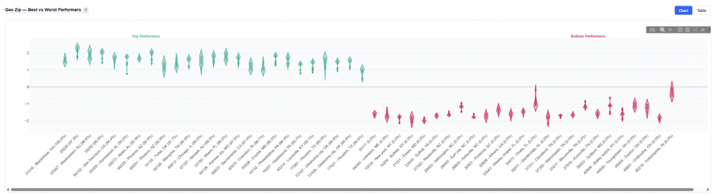
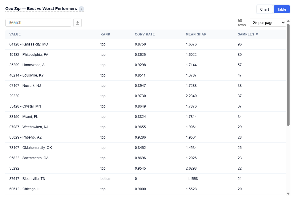
Best vs Worst Performers
This section highlights the highest and lowest performing values for a given dimension based on the model’s predictions and observed conversion rates.
Features include:
Geo Zip
Device Type
Content Genre
At a high level, it shows which values are driving strong positive or negative performance, along with how consistently they perform.
Chart View
Geo Zip Example:
Displays the distribution of SHAP values for top and bottom performing ZIP codes
Green violins = top performers (high predicted contribution to conversions)
Red violins = bottom performers (negative impact on conversion likelihood)
How to Read:
Above Zero (Green): Increases likelihood of conversion.
Below Zero (Red): Decreases likelihood of conversion.
Narrow Shape: Consistent performance across users.
Wide Shape: Variable performance across users.
Box Plot (inside the violin) – Shows the median (center line) and quartiles (typical range of values)
Table View
Provides detailed metrics for each feature:
Value: Feature dependent examples
Geo Zip: 85029 – Phoenix, AZ
Device Type: 3 – Connected TV (CTV)
Content Genre: food & cookiing
Rank: Top or Bottom performer
Conversion Rate : Observed conversion rate
Mean SHAP: Average contribution to model predictions
Samples: Number of observations (data volume)
Example Insight
64128 (Kansas City, MO) shows a strong conversion rate (87.50%) with a high positive mean SHAP (~1.67) and a solid sample size (96), indicating a reliable, high-performing market with both scale and consistency
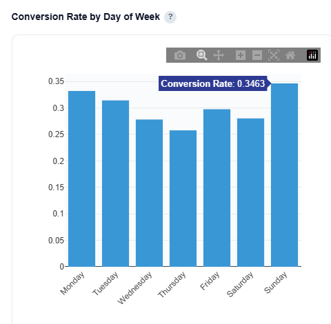
Conversion Rate by Day of Week
This section breaks down conversion rate by the day the ad was served, helping identify which days drive the strongest performance and can be used as a day parting optimization. These insights can be applied manually within the platform. If the model is applied to the campaign or line, day-of-week performance is automatically incorporated into real-time bidding decisions.
What It Shows:
Conversion rate for each day of the week
Performance trends across Monday–Sunday
Relative differences in efficiency by day
How to Use:
Identify high-performing days to increase spend or prioritize delivery
Identify underperforming days to reduce spend or adjust bidding
Inform dayparting strategies to improve overall efficiency
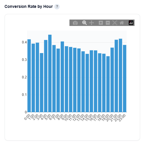
Conversion Rate by Hour
This section breaks down conversion rate by the hour the ad was served (0–23), helping identify peak performance windows throughout the day. These insights can be applied manually within the platform. If the model is applied to the campaign or line, day-of-week performance is automatically incorporated into real-time bidding decisions.
What It Shows:
Conversion rate for each hour of the day (0–23)
Performance trends across morning, afternoon, evening, and overnight
Relative differences in efficiency by hour
How to Use:
Identify peak hours to increase bids or prioritize delivery
Identify low-performing hours to reduce spend or adjust bidding
Inform hour-of-day bid adjustments to improve efficiency
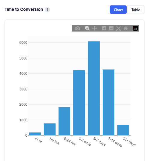
Time to Conversion
This section shows the distribution of time between when an ad was served and when a user converted, helping you understand how long the typical conversion path takes. Short times suggest direct response; long times suggest consideration-based purchase behavior.
Chart View
What It Shows:
Time between impression to conversion, grouped into time buckets:
<1 hr
1–6 hrs
6-24 hrs
1–3 days
3-7 days
7-14 days
14+ days
Volume of conversions occurring within each time window (hover to see the value).
Overall shape of the conversion lag distribution
Interpretation:
Short time to conversion indicates more direct response behavior
Longer time to conversion indicates more consideration-based or delayed decision-making
Peaks in specific time ranges highlight when users are most likely to convert after exposure
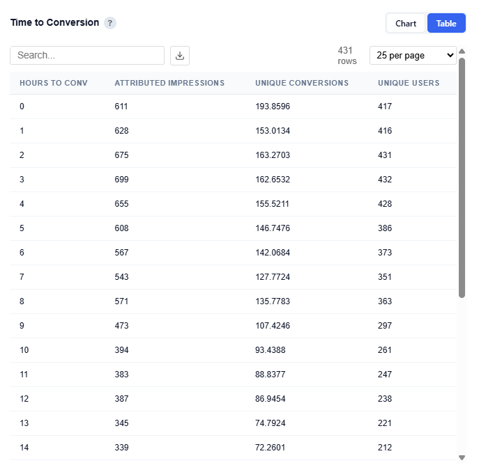
Table View
Example Insights:
Conversions are highest within the first few hours (0–3 hrs), indicating strong immediate response behavior
There is a secondary concentration in the 1–7 day range, suggesting some users convert after additional consideration
Very long conversion windows (14+ days) show lower volume, indicating diminishing impact over time
This distribution helps inform lookback window selection, attribution settings, and frequency strategy.
If conversions happen quickly (short lag), higher frequency over a shorter window can be effective.
If conversions take longer (delayed lag), sustained frequency over time is needed to stay top of mind.
Helps avoid overexposing users too early or underexposing during longer consideration periods.
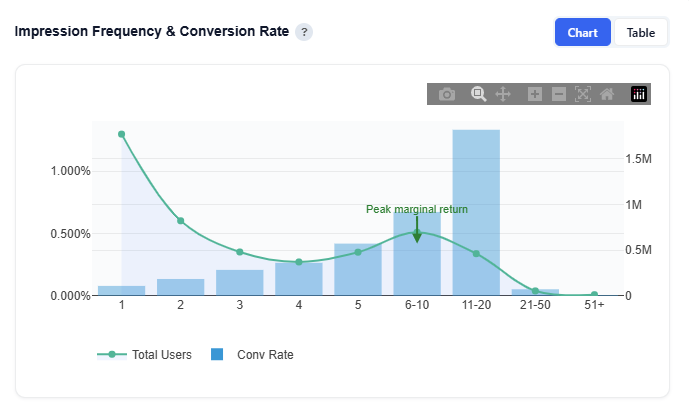
Impression Frequency & Conversion Rate
This section shows how conversion rate changes as users are exposed to more impressions, helping identify the optimal frequency for performance. Higher-frequency users typically had more time in the campaign, so results reflect correlation, not causation. Frequency should be interpreted alongside time-to-conversion and campaign duration.
Chart View
What It Shows:
Bars: Conversion rate at each impression frequency
Line: Total users reached at each frequency level
Green arrow annotation: Peak marginal return, the point where each additional impression drives the most incremental lift
How to Interpret:
Rising conversion rate: additional impressions are improving performance
Peak point (green marker): optimal frequency where incremental lift is highest
After peak: diminishing returns, where additional impressions add less value
User curve (line) : shows how many users are exposed at each frequency level
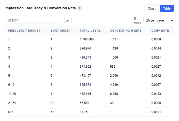
Table View
Provides detailed performance metrics at each impression frequency level:
Frequency Bucket: Number of impressions served per user
Total Users: Number of users reached at that frequency
Converting Users: Number of users who converted at that frequency
Conversion Rate: Conversion rate at that frequency level
Interpretation:
Find the optimal frequency
Identify the point where conversion rate is highest before diminishing returns.
Avoid overexposure
If performance drops at higher frequencies, you’re wasting impressions.
Balance scale vs efficiency
Higher frequency may increase conversion rate but reach fewer users.
Inform frequency caps and bidding strategy
Helps determine how often to show ads per user
Additional Notes:
Higher frequency users often had more time in the campaign, so results are correlated, not causal
Should be used alongside:
User volume (Total Users)
Time to conversion
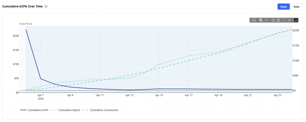
Cumulative eCPA Over Time
This section shows how spend and conversions accumulate over time, providing a complete view of attribution across the campaign and its lookback window.
Chart View
What It Shows:
Blue line: Cumulative eCPA (efficiency over time)
Green dotted line: Cumulative spend
Blue dotted line: Cumulative conversions
Shaded region: Actual study period (active campaign dates)
Interpretation:
Spend begins accumulating before the study period due to the lookback window
onversions continue after impressions are served, as users convert over time
Early in the timeline, eCPA may appear inflated or volatile because not all conversions have occurred yet
As time progresses, the lookback “tail” fills in, and eCPA stabilizes
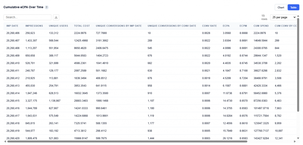
Table View
Provides a daily breakdown of spend, conversions, and efficiency metrics used to build the cumulative chart.
Columns:
Imp Date: Date impressions were served.
Impressions: Total impressions delivered on that date.
Unique Users: Number of distinct users reached.
Total Cost: Spend for that day.
Unique Conversions by Imp Date: Conversions attributed back to the date the impression occurred.
Unique Conversions by Conv Date: Conversions counted on the date the conversion actually happened.
Conversion Rate: Conversions relative to impressions for that day.
eCPA: Cost per acquisition or conversion. Calculated as: Total cost / Conversions.
eCPM: Cost per thousand impressions. Calculated as: Total cost / Impressions.
Cumulative Spend: Running total of spend over time.
Cumulative Conversions by Imp Date: Running total of conversions attributed back to impression dates.
Cumulative Conversions by Conv Date: Running total of conversions based on when conversions actually occurred.
Cumulative eCPA: Running cost per conversion over time, calculated from cumulative spend and cumulative conversions.
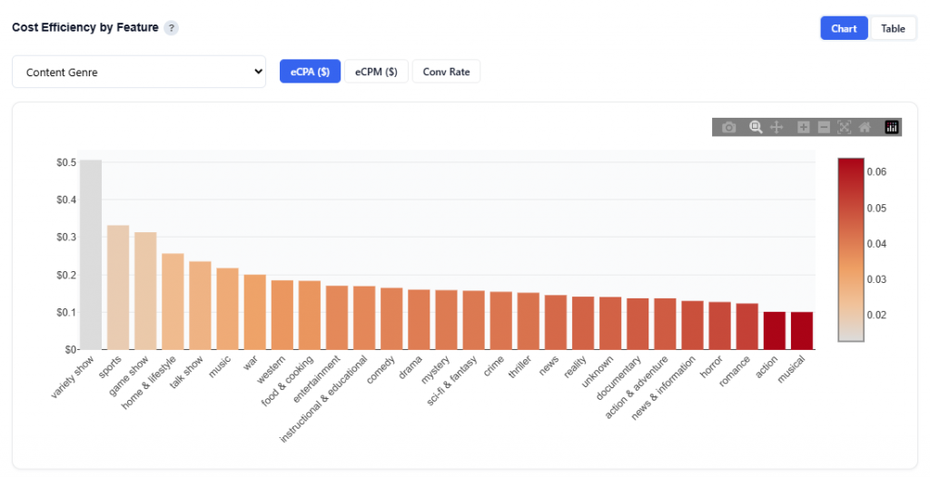
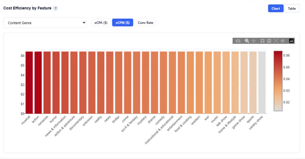
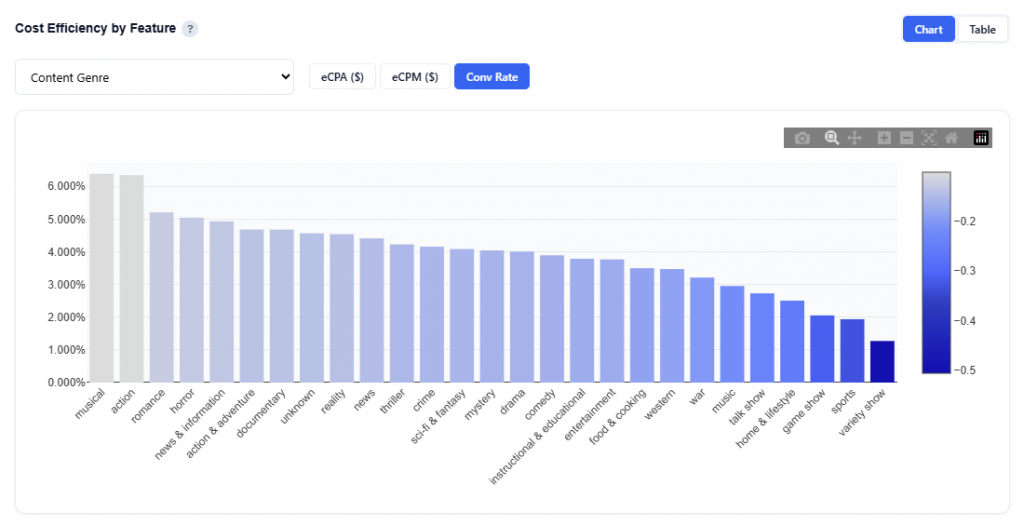
Cost Efficiency by Feature
This section compares cost and performance metrics across values of a selected feature, helping identify the most efficient segments to prioritize.
Select from the following features:
App Bundle
Content Genre
Content Series
Day
Device Type
Geo Region
Geo Zip
Hour
Publisher Name
Site Domain
Content Genre Example
eCPA ($): Cost per acquisition or conversion. Calculated as: Total cost / Conversions.
Shows cost per acquisition by feature value
Bars are sorted from lowest to highest eCPA
Color intensity reflects efficiency (darker = higher cost / less efficient)
Interpretation:
Look for shorter bars and lighter color. These are the most efficient segments.
These represent lowest cost per conversion (best ROI).
This is the primary view for optimization decisions
eCPM ($): Cost per thousand impressions. Calculated as: Total cost / Impressions.
Shows cost per thousand impressions by feature value
Bars are sorted from highest to lowest cost
Color intensity reflects relative cost (darker = more expensive)
Interpretation:
Look for shorter bars and lighter color. This is lower-cost inventory.
Use this to understand where you’re paying more or less to reach users.
Low cost doesn’t always mean good performance.
Conversion Rate: Efficiency of converting impressions
Shows conversion rate by feature value
Bars are sorted from highest to lowest conversion rate
Color reflects relative performance (darker = lower performance)
Interpretation:
Look for taller bars and lighter color. These are higher-performing segments.
These indicate where users are most likely to convert
Use this to identify strong audiences or content
Multi Variable
This section explores how multiple features interact together to influence conversion performance, rather than looking at each feature in isolation.
It helps uncover combinations of variables (e.g., Geo + Device + Content) that drive stronger or weaker outcomes.
Subsections:
Waterfalls
High Single Variables
Low Single Variables
High 2-Way
Low 2-Way
High 3-Way
Low 3-Way
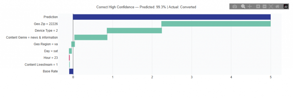
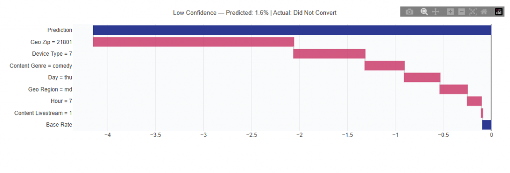
Waterfalls
This view explains how the model builds individual predictions. Each chart starts from a base rate and shows how each feature pushes the prediction up (green) or down (red) to reach the final score, making the model transparent rather than a black box.
High Confidence Example
Low Confidence Example
What It Shows:
Each chart starts from a base conversion rate (baseline prediction) Individual features are then added step-by-step
Each feature pushes the prediction up or down:
Green bars increase likelihood of conversion
Red bars decrease likelihood of conversion
The final value represents the model’s predicted conversion score
Interpretation:
Start at the base rate (average performance)
Follow each step to see how features contribute to the final prediction
Larger bars = stronger impact on the prediction
The final value shows how likely that specific combination is to convert
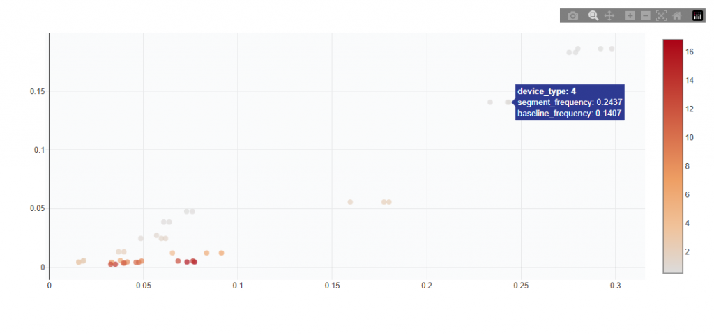
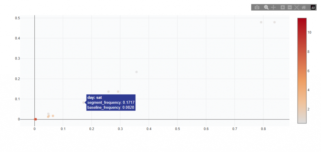
High Single Variables
This section identifies individual feature values that appear significantly more often in top-converting predictions than in the overall population. High lift means strong positive signal for targeting.\
Chart View
What It Shows:
Each point represents a single feature value (e.g., a specific ZIP, device type, or content genre)
Compares:
Overall frequency (how often it appears in the dataset)
Top-converting frequency (how often it appears in high-performing predictions)
Color indicates lift strength (darker = stronger signal)
Interpretation:
Points above the baseline appear more often in top-performing outcomes
Points further right are more common overall
Points higher on the chart show stronger positive signal
Darker color indicates higher lift and a stronger targeting signal
Table View
Provides detailed metrics for each high-performing single feature value identified by the model. Users can download the table as a CSV for further analysis.
Columns:
Segment: Which classification it falls under
Feature: The dimension being analyzed (e.g., Geo Zip, Device Type, Content Genre)
Value: The specific value within that feature
Segment Frequency: Share of this value within top-performing predictions
Baseline Frequency: Share of this value across the overall dataset
Lift: Ratio of Segment Frequency to Baseline Frequency showing how much more often this value appears in top-performing outcomes vs. normal.
Segment Count: Number of occurrences of this value within top-performing predictions
Unique IPs: Number of unique users associated with this value
Score: Model-derived strength of the signal. The higher the value the stronger the posititive contribution to conversion likelihood.
Interpretation:
High lift with high segment count indicates a strong and scalable opportunity
High lift with low segment count indicates a niche but promising segment that should be tested before scaling
Score reflects how impactful the value is within the model and helps prioritize which signals matter most
Low Single Variables
This section identifies individual feature values that appear significantly more often in low-converting predictions than in the overall population. Low lift indicates a negative signal and these segments may be deprioritized or excluded from targeting.
Chart View
What It Shows:
Each point represents a single feature value (e.g., a specific ZIP, device type, or content genre)
Compares:
Overall frequency (how often it appears in the dataset)
Low-converting frequency (how often it appears in low-performing predictions)
Color indicates lift strength (darker = stronger negative signal)
Interpretation:
Points above the baseline appear more often in low-performing outcomes
Points further right are more common overall
Points higher on the chart show stronger negative signal
Darker color indicates lower lift and a stronger signal to avoid
Table View
Provides detailed metrics for each low-performing single feature value identified by the model. Users can download the table as a CSV for further analysis.
Columns:
Segment: Which classification it falls under
Feature: The dimension being analyzed (e.g., Geo Zip, Device Type, Content Genre)
Value: The specific value within that feature
Segment Frequency: Share of this value within top-performing predictions
Baseline Frequency: Share of this value across the overall dataset
Lift: Ratio of Segment Frequency to Baseline Frequency showing how much more often this value appears in top-performing outcomes vs. normal.
Segment Count: Number of occurrences of this value within top-performing predictions
Unique IPs: Number of unique users associated with this value
Score: Model-derived strength of the signal. The higher the value the stronger the posititive contribution to conversion likelihood.
Interpretation:
Low lift with high segment count indicates a consistently underperforming segment that may be worth reducing or excluding
Low lift with low segment count indicates a weaker signal with limited impact
Score reflects how negatively the value impacts performance and helps prioritize what to deprioritize
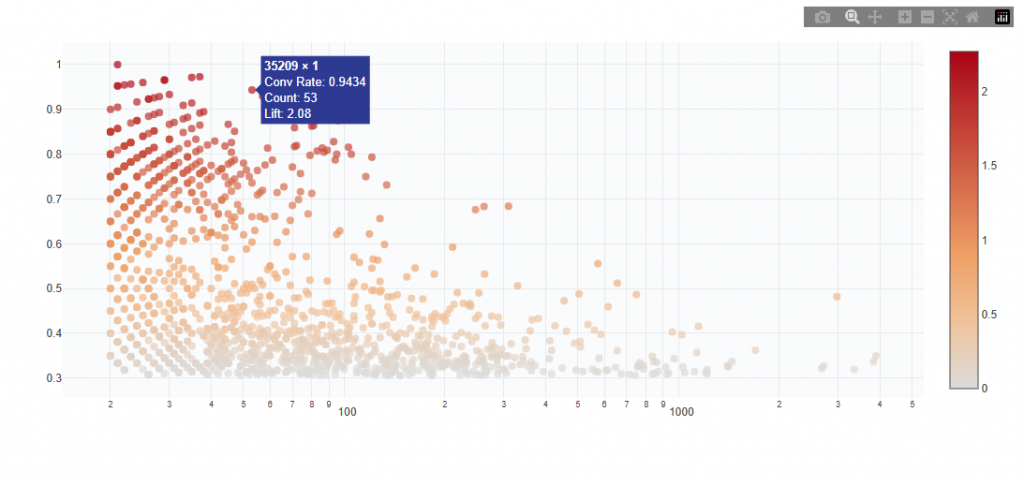
High 2-Way and High 3-Way
These sections identify combinations of feature values that together produce conversion rates above the campaign average.
2-Way: Combinations of two features (e.g., Geo Zip + Device)
3-Way: Combinations of three features (e.g., Geo Zip + Device + Day)
These represent layered signals, where performance improves when features are used together.
Chart View
What It Shows:
Each point represents a combination of feature values (e.g., 35209 × 1)
X-axis shows total count / volume (log scale)
Y-axis shows conversion rate
Color indicates lift vs campaign average (darker = stronger performance)
Interpretation:
Points higher on the chart have higher conversion rate
Points further right have more volume (more scalable)
Top-right quadrant contains the best combinations (high performance + scale)
Top-left quadrant contains high performance but low volume (niche opportunities)
Bottom-right quadrant contains high volume but lower performance (less efficient)
Color intensity shows stronger lift vs average (darker = better signal)
Example Insight:
35209 × 1 shows:
Very high conversion rate (~0.94)
Strong lift (~2.08x vs average)
Moderate volume (53 samples)
This indicates a high-performing combination with meaningful scale, making it a strong candidate for targeting.
Table View
Provides detailed metrics for each high-performing combination. Users can download the table as a CSV for further analysis.
Columns:
Feature 1: First dimension in the combination
Feature 2: Second dimension (and Feature 3 for 3-way analysis)
Conversion Rate: Conversion rate for this specific combination
Conversions: Total conversions generated
Total Count: Number of observations for this combination
Unique IPs: Number of unique users associated with this combination
Lift vs Avg: Performance relative to campaign average (>1 = above average performance)
Score: Model-derived strength of the signal (higher = stronger positive contribution to conversion likelihood)
p-value: Statistical significance of the result
p-adjusted: Adjusted p-value accounting for multiple comparisons
Significant: Indicates whether the result is statistically significant (TRUE/FALSE)
Interpretation:
High lift with high total count indicates a strong and scalable combination
High lift with low count indicates a promising but niche combination
Statistically significant results provide higher confidence in the signal
Score helps prioritize which combinations have the strongest impact
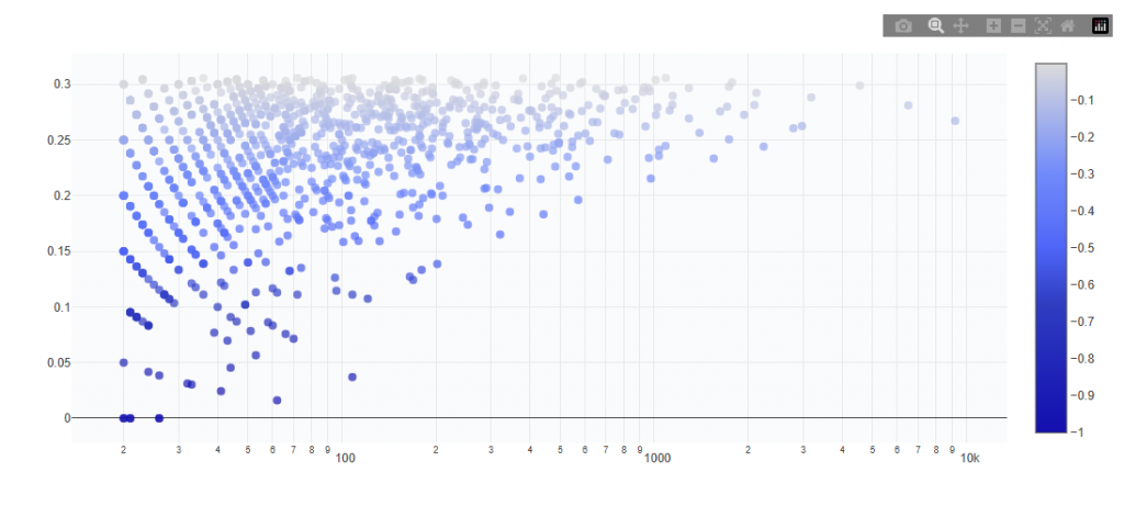
Low 2-Way and Low 3-Way
These sections identify combinations of feature values that together produce conversion rates below the campaign average.
2-Way = combinations of two features
3-Way = combinations of three features
These represent negative interaction signals, where performance declines when features are combined.
Chart View
What It Shows:
Each point represents a combination of feature values
X-axis shows total count / volume (log scale)
Y-axis shows conversion rate
Color indicates lift vs campaign average (darker blue = more negative performance)
Interpretation:
Points higher on the chart have higher conversion rate
Points further right have more volume (more scalable)
Bottom-right quadrant contains the worst combinations (low performance + high volume)
Bottom-left quadrant contains low performance but low volume (limited impact)
Top-right quadrant contains higher volume with moderate performance (mixed efficiency)
Top-left quadrant contains stronger performance but low volume (niche and less impactful)
Color intensity shows stronger negative lift vs average (darker = worse signal)
Table View
Provides detailed metrics for each low-performing combination of feature values. Users can download the table as a CSV for further analysis.
Columns:
Feature 1: First dimension in the combination
Feature 2: Second dimension (and Feature 3 for 3-way analysis)
Combination: Combined feature values
Conversion Rate: Conversion rate for this combination
Conversions: Total conversions generated
Total Count: Number of observations for this combination
Unique IPs: Number of unique users associated with this combination
Lift vs Avg: Performance relative to campaign average (<1 = below average performance)
Score: Model-derived strength of the signal (lower = stronger negative impact on conversion likelihood)
p-value: Statistical significance of the result
p-adjusted: Adjusted p-value accounting for multiple comparisons
Significant: Indicates whether the result is statistically significant (TRUE/FALSE)
Interpretation:
Low lift with high total count indicates a consistently underperforming combination that should be reduced or excluded
Low lift with low total count indicates a weaker signal with limited impact
Statistically significant results provide higher confidence in deprioritization decisions
Score reflects how strongly the combination negatively impacts performance and helps prioritize what to avoid
Explorer
The Explorer tab allows you to browse and interact with all available datasets used in the model. Select a dataset to view its chart and table. Use the metric buttons above charts to switch between available metrics.
What It Does:
Lists all datasets in the left-hand panel
Displays each selection as a chart and table
Allows switching between multiple metrics:
SHAP Value
Count
Conversions
Conversion Rate
This section is intentionally extensive and exploratory. Users are encouraged to navigate different datasets and metrics to uncover additional insights.
Charts
The Charts tab provides access to all visualizations generated by the model, organized into categories for easier navigation and analysis.
Charts are grouped into the following sections:
Categorical Features: Visual breakdowns of performance across individual feature dimensions
Waterfall Analysis: Shows how the model builds predictions step-by-step
SHAP Summary: Provides a comprehensive view of feature importance and impact across the model using multiple visualization types:
Heatmap: Shows how feature values impact predictions across observations
Decision Plot: Visualizes how features combine step-by-step to form predictions
Beeswarm Plot: Displays the distribution and direction of feature impact across all data
Bar Chart: Ranks features by overall importance
Feature Violin: Distribution of feature impact across all predictions
Downloads
The Downloads section provides full access to all model outputs, enabling deeper analysis, reporting, and sharing across teams. These outputs can be used for investigation and validation, but more importantly, the model can be applied directly to campaigns or line items, allowing insights to seamlessly translate into real-time bidding and optimization.
Available Downloads (JSON & CSV):
Executive Summary: High-level summary of findings, insights, and key drivers
High Confidence Single Variables: Top-performing individual feature values with strong positive signals
Low Confidence Single Variables: Underperforming individual feature values to deprioritize
High Performing 2-Way Combinations: Top-performing pairs of feature values
Low Performing 2-Way Combinations: Underperforming pairs of feature values
High Performing 3-Way Combinations: Top-performing combinations of three features
Low Performing 3-Way Combinations: Underperforming combinations of three features
CPA Predictions by Segment: Model-predicted cost efficiency across segments
All Combined: Complete dataset including all outputs in a single export
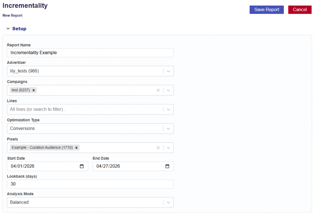
Incrementality
Section Coming Soon!
Incrementality Overview
The Incrementality report measures the true impact of advertising by comparing users who were exposed to ads against a matched control group who were not.
It identifies what actually works by removing organic conversions and calculating incremental lift, then uses these results to train a model that classifies ZIP codes based on incremental performance.
This model segments markets into actionable groups (e.g., Scale, Observe, Ignore), enabling direct application to targeting and real-time bidding strategies.
Use Case Examples
Understand the True Impact of Your Campaigns
Measure the incremental lift driven by your campaigns—so you can separate what your media is actually contributing from what could have happened anyway.
Prove the Value of Your Media Investment
Quantify how much of your performance is driven by advertising—so you can demonstrate CPA, ROI, and justify spend with confidence.
Optimize Budget and Reduce Waste with Incrementality Insights
Identify which campaigns, audiences, or strategies are truly driving incremental results—so you can shift budget toward what delivers real impact.
Identify underperforming or non-incremental ZIP codes and segments to further investigate—so you can refine messaging, creative, and targeting to improve efficiency and drive greater incremental lift.
Test and Validate Your Strategy
Evaluate different targeting strategies, creatives, or channels to understand what actually drives lift—so you can make smarter, data-backed decisions moving forward.
New Report Set Up
Choose how you want to analyze campaign impact, then configure campaign inputs, dates, and optimization settings to generate the report results and incremental model.
Instructions for generating a Incrementality Report and Model. Follow the steps for initial setup below:
Navigate to the Incrementality Tab
Click the New Report button
Give the report a name
Select the Advertiser to run the analysis on
Select the Campaign(s) within the chosen Advertiser.
If no campaigns are selected, all campaigns will be included.
Select the Line(s) within the chosen Campaign(s).
If no lines are selected, all lines will be included.
Select the Optimization Type:
Conversions
If selected, choose the conversion pixel to be used for optimization.
Clicks
Select the analysis Start Date.
Select the analysis End Date.
Enter the desired lookback window (in days).
Default is 30 days.
This defines how far back the model will attribute conversions or clicks to ad exposure.
Select the Analysis Mode:
Fast: Runs quickly using a smaller sample size for directional insights with lower statistical confidence.
Balanced: Provides a balance between speed and statistical reliability, suitable for most analyses.
Thorough: Uses the largest sample and most rigorous evaluation for maximum accuracy and highest statistical confidence.
Click the Save Report button.
Key Notes:
Requires campaign delivery and pixel fires or clicks to measure incrementality
Uses exposed vs. control methodology to train a model that classifies ZIP-level performance
Outputs are directly usable for targeting, budget allocation, and real-time bidding strategies
Report Results
The Incrementality Reports results include the pipeline used, date created, when the report started, and when the reported completed. The output is separated into 5 sections:
Summary
Dashboard
Explorer
Charts
Downloads
This information provides a complete audit trail and transparency into the model, allowing users to understand how results are generated and directly tie insights back to campaign performance, rather than relying on a black-box approach.
Summary
The Summary section provides a high-level overview of the analysis, including the Report ID, Advertiser ID, and Date Range, along with an automatically generated Executive Summary. The Executive Summary explains what is driving incremental performance and highlights where advertising is creating true lift, helping inform optimization decisions using model-based predictions.
Tip: You can input the Executive Summary into your preferred LLM (e.g., ChatGPT or Claude) to quickly generate a presentation deck or case study based on the results.
Dashboard
The Dashboard provides a visual overview of incremental lift and true campaign impact, comparing exposed users (who saw ads) against a matched control group (who did not).
Exposed Group: Unique IPs served ads, matched to pixel fires where the ad was shown before conversion within the lookback window
Control Group: 1% random sample of bid stream IPs in the same ZIPs and deal IDs, not served ads, matched to the same pixel fires
ZIP codes are filtered to within 1 standard deviation of mean impression volume to ensure reliable comparisons.
The model classifies ZIPs into:
Scale: Strong positive lift with high confidence
Observe: Moderate or emerging signal
Ignore: No measurable incremental impact
Block: Negative lift
Dashboard Sections:
Tile Metrics
ZIP Classification — Scale / Observe / Ignore / Block
Geographic Analysis
Top Scale ZIPs — Incremental Conversions
Lift Distribution Across ZIPs
Exposed vs Control — Conversion Rate by ZIP
Ad Impact by ZIP — Control vs Exposed Conversion Rate
Tile Metrics
Overall Lift: Percentage increase in conversion rate for users who saw ads versus those who did not. Positive = ads are driving incremental impact. Range in brackets is the 95% bootstrap confidence interval.
Incremental Conversions: Estimated conversions that would NOT have happened without advertising. Range in brackets is the 95% bootstrap confidence interval.
ZIPs Analyzed: ZIP codes with impression volume within 1 standard deviation of the mean – statistically meaningful sample sizes.
Scale: ZIPs with high positive lift and high confidence – increase budget here.
Block: ZIPs with negative or zero lift – ads are not working here, stop spending.
Exposed Users: Unique IPs served ads by this campaign.
Exposed Conversions: Unique exposed IPs that fired the pixel AFTER being served an ad (within lookback window). Matched via pixel server logs.
Exposed CR: Conversion rate for the exposed group (Exposed Conversions / Exposed Users).
Control Users: Unique IPs from 1% sample bid steam in the same ZIPs and deal IDs, NOT served ads by this campaign.
Control Conversions: Unique control IPs that fired the pixel AFTER their sample request (within lookback window). Same pixel server log source as exposed – apples to apples comparison.
Control CR: Conversion rate for the control group (Control Conversions / Control Users). This is the baseline organic conversion rate.
FDR Significant: ZIPs that pass Benjamini-Hochberg FDR correction at 10% – these lift estimates are statistically reliable after correcting for multiple comparisons.
Underpowered ZIPs: ZIPs where sample size is too small to detect the observed lift reliably (lift < minimum detectable effect). These are classified as Observe regardless of lift magnitude.
Incremental CPA: True cost per conversion caused by advertising: (Spend / Incremental Conversions. This is the honest acquisition cost – excludes conversions that may have happened anyway.
Standard CPA: Traditional cost per conversion: (Spend / All Conversions). Lower than incremental CPA because it counts conversions that would have happened possibly without ads.
CPA Inflation: How much higher the true (incremental) CPA is vs standard CPA. A factor of 2x means that the real cost of acquiring a customer is twice what standard reporting suggests.
Total Spend: The total media spend across al ZIPs (full volume, no down sampling).
ZIP Classification — Scale / Observe / Ignore / Block
This section categorizes ZIP codes based on incremental lift and statistical confidence, helping identify where advertising is driving real impact and where it is not. Each ZIP is classified based on its lift magnitude, statistical confidence, and sample quality. Scale indicates high lift with strong confidence, while Block reflects negative lift or no measurable effect.
Chart View
What It Shows
Each ZIP is classified into one of four groups based on:
Lift magnitude (positive or negative impact)
Statistical confidence (reliability of the result)
Classification Definitions
Scale: ZIPs with strong positive lift and high statistical confidence
Proven to drive incremental conversions
Best candidates for increased budget and expansion
Observe: ZIPs with moderate or emerging signals
Potential to perform well but require more data
Suitable for continued testing and monitoring
Ignore: ZIPs with no measurable incremental impact
Conversions likely occurring organically
Candidates for reduced spend or deprioritize
Block: ZIPs with negative lift
Advertising may be harming performance
Should be excluded from targeting
Table View
This table provides the full ZIP-level output of the incrementality model, combining exposure data, lift measurement, statistical confidence, and cost efficiency. Users can download this table as a CSV file for further analysis.
Columns:
Geo ZIP: ZIP code being evaluated
Unique Users Control: Number of users not served ads
Conversions Control: Total conversions from control group
Unique Converting IPs Control: Unique converters in control group
Diversity Ratio Control: Distribution of conversions across users in control group
Unique Users Exposed: Number of users served ads
Conversions Exposed: Total conversions from exposed users
Unique Converting IPs Exposed: Unique converters in exposed group
Diversity Ratio Exposed: Distribution of conversions across users in exposed group
CR Control Raw: Raw conversion rate for control group
CR Exposed Raw: Raw conversion rate for exposed users
Raw Lift: Difference between exposed and control conversion rates
Diversity Valid Exposed: Whether exposed data passes diversity validation checks
Diversity Confidence: Confidence in diversity-based data reliability
CR Control Bayes: Bayesian-adjusted conversion rate for control group
CR Exposed Bayes: Bayesian-adjusted conversion rate for exposed users
CR Control CI Low: Lower bound of control conversion rate confidence interval
CR Control CI High: Upper bound of control conversion rate confidence interval
CR Exposed CI Low: Lower bound of exposed conversion rate confidence interval
CR Exposed CI High: Upper bound of exposed conversion rate confidence interval
Incremental Conversions: Estimated conversions driven by advertising
Lift Confidence: Confidence level of the lift estimate
Relative Lift: Percent increase in conversion rate vs control
Probability Positive: Probability that lift is positive
Probability Large Positive: Probability of strong positive lift
Probability Negative: Probability that lift is negative
Expected Lift: Average expected lift value
Lift Std: Standard deviation of lift
Lift 5th Percentile: Lower bound of lift estimate range
Lift 95th Percentile: Upper bound of lift estimate range
Expected Value: Expected economic value generated by lift
Value Std: Standard deviation of expected value
Probability Profitable: Probability that the ZIP is profitable
Value 5th Percentile: Lower bound of expected value
Value 95th Percentile: Upper bound of expected value
Sample Adequacy Score: Score indicating if sample size is sufficient
Incremental Conv CI Low: Lower bound of incremental conversions
Incremental Conv CI High: Upper bound of incremental conversions
Classification: Final label (Scale, Observe, Ignore, Block)
P Adjusted: P-value adjusted for multiple comparisons
FDR Significant: Whether result is statistically significant after correction
Min Detectable Lift: Minimum lift detectable with current sample size
Lift vs Avg: Lift relative to campaign average
Unique IPs: Total unique users observed
Score: Model-derived ranking score for prioritization
City: City name
State ID: State abbreviation
Total Spend: Total spend in the ZIP
CPM: Cost per thousand impressions
Total Impressions: Total impressions served
Incremental CPA: Cost per incremental conversion
Standard CPA: Traditional cost per conversion
Geographic Analysis
This section visualizes ZIP-level performance, showing how incremental impact varies across locations.
Each dot represents an analyzed ZIP code, allowing you to quickly identify where advertising is working and where it is not.
Toggle Views:
Classification: Colors ZIPs by Scale, Observe, Ignore, Block
Quickly identify high- and low-performing markets
Impressions Served: Dot size represents user volume / impressions
Larger dots = more reach and spend
Lift Magnitude: Color represents direction and strength of lift
Green lift (positive) = stronger incremental impact
Red lift (negative) = underperformance
Classification
What It Shows:
Quickly identify where to scale (Scale) and where to monitor (Observe and Ignore)
Look for clusters of Scale ZIPs to find high-performing regions
Use alongside other views to understand both performance and scale
Hover Data:
ZIP code, name and state
Lift: Lift relative to the analysis’s average
Users: Unique users exposed to in that ZIP
Incremental Conversions: The number of additional conversions driven by the ad
FDR Significance: Indicates whether the lift is statistically reliable
Impressions Served
What It Shows:
Dot size represents impressions served
Color scale reflects Lift vs. Average intensity:
Light blue = below average / negative lift
Red = above average / positive lift
Hover Data:
ZIP code, name and state
Lift: Lift relative to the analysis’s average
Users: Unique users exposed to in that ZIP
Incremental Conversions: The number of additional conversions driven by the ad
FDR Significance: Indicates whether the lift is statistically reliable
Lift Magnitude
What It Shows:
Color represents direction and strength of lift
Green (Positive) lift = ads are driving incremental conversions
Red (Negative) lift = ads are underperforming
Hover Data:
ZIP code, name and state
Lift: Lift relative to the analysis’s average
Users: Unique users exposed to in that ZIP
Incremental Conversions: The number of additional conversions driven by the ad
FDR Significance: Indicates whether the lift is statistically reliable
Table View
This is the same table as the previous section, ZIP Classification — Scale / Observe / Ignore / Block. Refer to the above section for detailed column definitions and interpretation.
Top Scale ZIPs — Incremental Conversions
This section highlights ZIPs classified as Scale (high lift, high confidence), ranked by estimated incremental conversions. Error bars show the 90% credible interval from Monte Carlo simulation. These are the proven winners – increase budget here.
Chart View
What It Shows:
Only ZIPs classified as Scale Ranked by incremental conversions (highest at the bottom)
Bars represent the estimated number of conversions driven by ads
Error bars show the 90% credible interval from Monte Carlo simulation
Reflect the range of likely outcomes
Narrower intervals = more confidence
Wider intervals = greater uncertainty
Hover to see the Incremental Conversions
Identify proven high-impact ZIPs backed by statistical confidence.
Table View
This is the same dataset as the ZIP Classification table, filtered to Scale ZIPs only. Refer to the ZIP Classification — Scale / Observe / Ignore / Block section for full column definitions.
Lift Distribution Across ZIPs
This chart shows the distribution of relative lift (%) across all analyzed ZIP codes, helping you understand how incremental performance is spread across your campaign.
Chart View
What It Shows:
Histogram of relative lift (%) for all ZIPs
Each bar represents the number of ZIPs within a lift range
The vertical dashed line at 0 represents no incremental impact
Interpretation:
Right of zero (positive lift): ZIPs where advertising is driving incremental conversions
Left of zero (negative lift): ZIPs where advertising is not effective or may be harming performance
Cluster around zero: ZIPs with little to no measurable incremental impact
Long right tail: A small number of ZIPs driving very high incremental lift
Why It’s Useful:
Shows whether performance is broadly distributed or concentrated
Helps assess overall campaign effectiveness
Identifies if results are driven by:
Many moderately positive ZIPs
Or a few high-impact outliers
Table View
This is the same dataset as the ZIP Classification table. Refer to the ZIP Classification — Scale / Observe / Ignore / Block section for full column definitions.
Exposed vs Control — Conversion Rate by ZIP
This chart compares conversion rates between users who saw ads (exposed) and those who did not (control) across each ZIP code, showing where advertising is driving true incremental impact.
Chart View
What It Shows:
Each do represents a ZIP code
X-axis (Control CR): Conversion rate of users who were eligible but not served ads (baseline)
Y-axis (Exposed CR): Conversion rate of users who were served ads
The diagonal line represents equal performance between exposed and control
Interpretation:
Above the diagonal: Exposed CR > Control CR and ads are driving incremental conversions
Below the diagonal: Exposed CR < Control CR and ads may be ineffective or counterproductive
Near the line: Minimal difference and/or little to no measurable incremental impact
Farther from the line: Greater difference and stronger positive or negative impact
Table View
This is the same dataset as the ZIP Classification table. Refer to the ZIP Classification — Scale / Observe / Ignore / Block section for full column definitions.
Ad Impact by ZIP — Control vs Exposed Conversion Rate
This chart shows the direct impact of advertising at the ZIP level by comparing conversion rates between control (no ads) and exposed (with ads) users and visualizing the lift.
Chart View
What It Shows:
Each row represents a ZIP code
Blue dot: Control conversion rate (baseline, no ads)
Green dot: Exposed conversion rate (with ads)
The line connecting the dots represents the incremental lift
Longer lines = larger impact
Whiskers on each dot show the 95% credible intervals
Hover Data:
ZIP Code and name
Conversion Rate
FDR-adjusted p-value: Indicates statistical confidence after correcting for multiple comparisons
Lower values = higher confidence
Helps confirm whether observed lift is reliable
Table View
This is the same dataset as the ZIP Classification table. Refer to the ZIP Classification — Scale / Observe / Ignore / Block section for full column definitions.
Explorer
The Explorer tab allows you to browse and interact with all available datasets used in the model. Select a dataset to view its chart and table. Use the metric buttons above charts to switch between available metrics.
What It Does:
Lists all datasets in the left-hand panel
Displays each selection as a chart and table
This section is intentionally extensive and exploratory. Users are encouraged to navigate different datasets and metrics to uncover additional insights.
Charts
The Charts tab provides access to all visualizations generated by the model, organized into categories for easier navigation and analysis.
Charts are grouped into the following sections:
Decision Support
Distributions
Confidence
Geographic
Downloads
The Downloads section provides full access to all model outputs, enabling deeper analysis, reporting, and sharing across teams. These outputs can be used for investigation and validation, but more importantly, the model can be applied directly to campaigns or line items, allowing insights to seamlessly translate into real-time bidding and optimization.
Available Downloads (JSON & CSV):
Executive Summary: High-level summary of findings, insights, and key drivers
ZIP Classification (Scale/Observe/Ignore/Block)
High-Lift ZIPs (Scale Targets)
Full ZIP-Level Lift Data
Campaign Summary Metrics
Incremental CPA by ZIP
Targeting Rules (JSON)
All Combined
Analytics Model Association
Insights are only as powerful as your ability to act on them. With our new Analytics Suite capabilities, you can now take analytics outputs as an optimization model and apply them directly to your campaigns instantly.
No manual translation. No workflow gaps. Just seamless activation.
The Custom Model tab, available at both the Campaign and Line levels, brings your models directly into the Targeting workflow, giving you greater control over how and where your models are applied to your campaigns.
To learn more about the analytics models and for instructions on how to generate a report/model, see here: Analytics Documentation
From Analysis to Activation:
Generate a Targeting, Audience, Incrementality, or Full Analysis (all three pipelines combined) report
Navigate to the Targeting section at the Campaign or Line level
Select the Custom Model tab
Enable the Use Custom Models feature
Choose a model from the available list
Once enabled, a table will display all available models associated with the advertiser. Each model includes the following information to help guide selection:
Name: The name of the report/model
Date: When the report/model was generated. If you Save & Rerun the original report, the model will automatically update.
Pipeline: The type of analysis used to generate the model (Targeting, Audience, Incrementality, or Full Analysis)
Entities: Indicates whether the model was built at the Advertiser, Campaign, or Line level
This streamlined workflow makes it easy to select the most relevant model and move from insight to action in seconds!
Public Models
CTR Models
Public CTR models are available to all seats with the Analytics Platform enabled. To gain access reach out to your Account Manager or through the Help Center.
Users can enable Use custom models in the Targeting section > Custom Models tab located on the Campaign and Line level and select from the available public CTR models. These models can be associated at either the Campaign or Line level.
Available public CTR models include:
ctr_public_us
ctr_public_eu
Note that these models work the best with broader targeting. Applying to a Campaign or Line with tight geo targeting may result in pacing issues.